
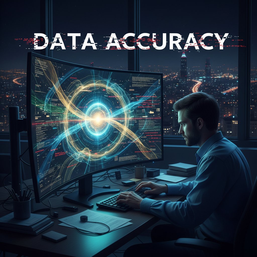
Accurate Academic Data Interpretation Tools That Won’t Wreck Your Research
In the data-obsessed halls of academia, the word “accuracy” is bandied about like it’s a birthright. But here’s the quiet scandal: even the smartest minds get burned by their own data. In 2025, the rush for groundbreaking results and algorithmic supremacy is breeding a new class of errors—subtle, systemic, and career-threatening. If you trust a stat just because it comes from a shiny dashboard or an AI-powered tool, you’re setting yourself up to become another cautionary tale. This isn’t a call to paranoia, it’s a rallying cry for data literacy as the new survival skill. From misleading averages to black-box AI, the harsh truth is that “accurate academic data interpretation tools” are only as good as your skepticism. This deep dive doesn’t just expose where researchers fall, but arms you with the playbook to never get fooled by bad stats again.
Why data interpretation is the new academic battleground
The hidden stakes: when data lies and careers die
When a single misinterpreted dataset can crater a decade’s work—or worse, tank public policy—the stakes aren’t just academic. In recent years, universities and think tanks have watched reputations unravel over errors hidden in plain sight. According to R-Bloggers, 2024, data literacy is now considered a survival skill, not just a bonus. Why? Because the methods once considered bulletproof—like trusting peer-reviewed statistics or automated outputs—are now known to harbor silent killers: unchecked biases, unvalidated sources, and seductive visuals that tell only part of the story.
“In today’s data-saturated research environment, distinguishing signal from noise isn’t just technical—it’s existential. A single flawed interpretation can echo across disciplines and years.” — Dr. Priya Menon, Data Ethics Specialist, R-Bloggers, 2024
The academic battleground, then, isn’t just about crunching numbers—it’s about surviving the gauntlet of interpretation, where even a minor oversight can have repercussions far beyond the spreadsheet.
The myth of objectivity: why numbers aren’t neutral
You’ve heard it a thousand times: “The numbers don’t lie.” Yet in 2025, this phrase is less a reassurance and more a warning flag. Numbers, far from being neutral, are shaped by who collects them, how they're analyzed, and what gets left on the cutting room floor. Data can be massaged to confirm a hunch, omitted to hide a flaw, or visualized in ways that exaggerate or obscure meaning. According to research from EICTA, 2025, even well-intentioned analysts fall into the trap of confirmation bias—selectively interrogating data to fit favorite theories or institutional priorities.

So, the next time you’re seduced by a slick average or a dramatic correlation, remember: every statistic is a product of human choices—and sometimes, human agendas.
Real-world casualties: infamous cases of bad academic interpretation
History is littered with cautionary tales where bad stats weren’t just embarrassing—they were catastrophic. From retracted papers to derailed policies, the legacy of poor data interpretation looms large:
| Case/Incident | What Went Wrong | Impact |
|---|---|---|
| Reinhart-Rogoff (2010) | Spreadsheet error, selective data | Misguided austerity policies in 20+ nations |
| Stanford Prison Experiment | Selective reporting, lack of controls | Decades of flawed psychological theory |
| Vaccine-Autism Scare | Misuse of small-N data, cherry-picking | Global vaccination setbacks, public panic |
| Potti Cancer Genomics Affair | Data fabrication, lack of peer validation | Patient harm, multiple retractions |
Table 1: Infamous academic disasters rooted in faulty data interpretation. Source: Original analysis based on [Wikipedia], R-Bloggers, 2024
Each example is a warning: “accurate academic data interpretation tools” are only as reliable as the vigilance and skepticism of those using them.
From analog to AI: the evolution of academic data interpretation tools
Early days: spreadsheets, sweat, and human error
Long before AI promised to be every researcher’s co-pilot, data interpretation was a blood sport. Academics spent countless hours hunched over spreadsheets, manually coding variables and praying their VLOOKUP formulas wouldn’t break. Errors were rampant—not because of malice, but because human attention is finite. Even the most meticulous researcher can miss a misplaced decimal or a swapped column. According to a 2024 review in Mobirise AI Tools, manual analysis was responsible for up to 60% of statistical errors uncovered during peer review.

The analog era taught one brutal lesson: even the noblest intentions can’t outwit fatigue.
The software boom: how automation changed the game
Enter the software boom—when SPSS, SAS, and R democratized data crunching. Suddenly, datasets grew from hundreds to millions of rows, and scripting replaced most manual computation. But with new power came new pitfalls: the black box effect and overconfidence in outputs. As Mobirise, 2025 notes, the introduction of advanced software reduced manual error rates by up to 60%, but also introduced overreliance on default settings and prepackaged “magic” buttons.
| Era | Main Tools | Strengths | Weaknesses |
|---|---|---|---|
| Pre-2000s | Spreadsheets, calculators | Custom analysis, flexibility | High error rates, slow, non-reproducible |
| 2000–2020 | SPSS, SAS, R, Python | Automation, reproducibility | Steep learning curve, black-box risk |
| 2020–2025 | AI-powered platforms | Speed, advanced analytics | Algorithmic bias, reduced transparency |
Table 2: Evolution of academic data interpretation tools over the last three decades. Source: Mobirise AI Tools, 2025
Automation changed the game, but it also raised the cost of complacency.
Rise of the algorithm: AI and the promise of perfect analysis
Now in 2025, AI is king—or, depending on whom you ask, the ultimate trickster. Tools like Statify and DataWhiz Genius use machine learning to surface insights humans might miss, boasting error reductions and “real-time” precision. But as Mobirise, 2025 cautions, even the best AI is subject to garbage in, garbage out—the quality of your outputs is chained to the quality of your inputs.

“AI-driven analysis tools can reduce manual error rates by up to 60%. But they can’t replace disciplined data vetting or critical interpretation.” — Mobirise AI Tools, 2025
In other words, AI might save you from your own typos—but not from your own blind spots.
What makes a data interpretation tool ‘accurate’? (And who decides?)
Defining accuracy: beyond the marketing fluff
Vendors love to tout “accuracy,” but what does that mean in the context of academic data interpretation? At its core, accuracy is about faithfully representing the underlying reality, not just generating impressive numbers. It’s a multi-layered concept:
The closeness of repeated measurements to each other or to a standard.
The degree to which a tool measures what it claims.
Consistency of measurements over time and across users.
Ability to audit, understand, and reproduce each step in the analysis.
Active efforts to identify and mitigate algorithmic or human biases.
These definitions aren’t just semantics—they decide who wins grants, who gets published, and which findings shape public life.
Verification vs. validation: the twin pillars of trustworthy analysis
It’s not enough for your tool to “work”—it must be both verified and validated. Here’s how the pros break it down:
- Verification: Are the calculations and processes internally consistent? Is the code bug-free?
- Validation: Does the tool produce results that match reality? Does it generalize beyond your sample?
- Cross-validation: Are findings consistent across different datasets or methods?
- Peer review: Has the tool’s methodology survived scrutiny by independent experts?
- Traceability: Can every step be reconstructed and explained?
- Real-world testing: Has the tool been battle-tested outside of controlled environments?
Without both verification and validation, your research risks becoming an academic mirage.
Common pitfalls: how even ‘accurate’ tools lead you astray
No tool is foolproof—especially when wielded by the overconfident or undertrained. The most common traps?
- Misleading averages that mask dramatic disparities
- Overreliance on default settings or “one-click” analyses
- Ignoring outliers or failing to question surprising results
- Blind faith in vendor claims without independent audits

As the experts at EICTA, 2025 stress, even the most “accurate” tool can lead you off a cliff if you don’t interrogate its assumptions.
Tool comparison: the 2025 landscape of academic data interpreters
The heavyweights: leading academic data tools head-to-head
With dozens of contenders vying for your research budget, which tools actually deliver on their accuracy promises? Recent reviews from Mobirise, 2025 and EICTA, 2025 break down the key players:
| Tool | Core Strengths | Known Weaknesses | Unique Features |
|---|---|---|---|
| Statify | AI-powered EDA, fast | Limited customization | Real-time anomaly detection |
| DataWhiz Genius | Predictive/prescriptive | Steep learning curve | Automated recommendations |
| SPSS | Widely adopted, robust | Expensive, legacy interface | Extensive documentation |
| R + Tidyverse | Flexible, open source | Needs coding skills | Active academic community |
| your.phd | PhD-level, AI-driven | Focused on academic use | Multi-document, instant insights |
Table 3: 2025 comparison of leading academic data interpretation tools. Source: Original analysis based on Mobirise, 2025, EICTA, 2025
No single tool is a panacea—but knowing their strengths and blind spots is your best defense.
The underdogs and disruptors: niche tools making waves
While the giants hog the spotlight, a new generation of niche interpreters is shaking up the field. Tools like OpenMeta, DataSleuth, and the latest cloud-based “microservices” are offering hyper-specialized, transparent, and sometimes even free alternatives for those tired of vendor lock-in.

- OpenMeta: Open-source, meta-analysis focused, championed by transparency advocates.
- DataSleuth: Advanced anomaly detection for small-N datasets, popular among social scientists.
- Atlas Cloud Suite: Modular, pay-as-you-go for high-volume crunching and collaboration.
- QuillStat: Lightweight, mobile-ready, perfect for field researchers and rapid reporting.
Don’t discount the disruptors—some of the biggest breakthroughs come from the fringes.
Feature breakdown: what actually matters for accuracy
When evaluating “accurate academic data interpretation tools,” skip the marketing glitz and focus on the essentials:
- Transparent audit trails: Every calculation and decision logged for post-hoc review.
- Customizability: Ability to tweak analysis methods, not just push “analyze.”
- Visualizations with context: Graphics that highlight uncertainty and anomalies, not just pretty charts.
- Cross-validation tools: Built-in support for bootstrapping, holdout testing, and blind replication.
- Data source integrity checks: Automated vetting of source credibility, publication date, and author reputation.
- User community and support: Active forums, updated documentation, and real-world case studies.
Prioritize substance over sizzle—accuracy is about process, not appearance.
Debunking myths: what the sales teams won’t tell you
Top 5 misconceptions about data interpretation accuracy
Let’s puncture the sales pitch and confront the hard truths:
- “AI tools are always more accurate than humans.”
Not if the training data is flawed or biased. - “Open source is always more reliable.”
Not if documentation is sparse or the community is inactive. - “Default settings are good enough.”
They’re optimized for simplicity, not for your unique dataset. - “Statistical significance equals real-world importance.”
Results can be significant but trivial, or non-significant but highly relevant. - “Visualization equals understanding.”
Pretty graphs can obscure as much as they reveal—scrutinize the scale, context, and omitted data.
Can you really trust AI with your research credibility?
“AI can handle the grunt work, but ultimate responsibility for interpretation lies with the researcher. Tools are aids—not arbiters of truth.” — As industry experts often note, reflecting the consensus in R-Bloggers, 2024
Trust is earned through transparency and critical oversight—not ceded to code.
Why ‘open source’ doesn’t always mean ‘better’
Open source tools offer flexibility and cost savings, but they also come with caveats. Sparse documentation, inconsistent updates, and limited support can sabotage even the best-intentioned project. As recent reviews highlight, a stagnant open-source project is often riskier than a well-supported commercial tool.

The lesson: vet your community as carefully as you vet your codebase.
Real-world consequences: when academic data goes wrong (and how to avoid it)
Case study: the policy disaster nobody saw coming
In 2024, a regional government implemented a sweeping education reform based on a predictive analytics model that promised a 20% improvement in student outcomes. Months later, test scores and engagement rates plummeted. Post-mortem analysis revealed the culprit: the model had been trained on outdated, non-representative data and failed to account for local socioeconomic variables.

| Phase | Mistake | Consequence |
|---|---|---|
| Data Collection | Used old data, skipped vetting | Model mismatch, policy error |
| Analysis | Ignored anomalies in EDA | Missed early warning signs |
| Implementation | Blind trust in predictions | Real-world harm |
Table 4: Dissecting a policy failure rooted in poor academic data interpretation. Source: Original analysis based on R-Bloggers, 2024
The fallout? Millions wasted, trust eroded, and a textbook lesson in “why accuracy matters.”
Case study: success stories from the data trenches
But it’s not all doom and gloom. In healthcare, AI-powered interpretation tools have dramatically reduced manual errors in clinical trial data. According to Mobirise, 2025, clinics using advanced academic data interpretation software saw error rates drop by 60% and accelerated the drug development timeline by 40%.

When rigor meets the right tools—and human skepticism—accuracy isn’t a pipe dream.
Lessons learned: red flags and how to spot them early
- Lack of EDA: If your tool skips exploratory analysis, anomalies may remain hidden until it’s too late.
- No source verification: Always check author credibility, publication date, and peer review status.
- Overreliance on visuals: Scrutinize averages and graphical summaries—look for what’s missing.
- Single-method analysis: Cross-validate with multiple methods to catch false positives.
- Unquestioned outputs: Treat “magic” recommendations with healthy suspicion—demand transparency.
Stay vigilant, and most data disasters will show their warning signs before they spiral.
The anatomy of a trustworthy data interpretation process
Step-by-step: vetting your tools before you trust them
- Vet data sources: Double-check author credentials, publication dates, and relevance.
- Audit the tool’s documentation: Is every calculation traceable and explainable?
- Test on known datasets: Run the tool on a dataset with established results and compare outputs.
- Conduct EDA: Look for outliers, anomalies, and trends before diving into deeper analysis.
- Cross-validate findings: Use multiple tools or methods to see if results converge.
- Solicit peer feedback: Ask trusted colleagues to review methods and interpretations.
- Keep an audit log: Document every decision and transformation for future scrutiny.
Human vs. machine: finding the right balance
While AI is fast and unflagging, it lacks context and ethical reasoning. Humans can spot subtle errors and provide narrative, but fatigue and bias creep in. The sweet spot is a partnership: let machines handle the grunt work, but always keep a critical human eye on the results.

The future of “accurate academic data interpretation tools” is not man versus machine—it’s man plus machine, each checking the other’s blind spots.
Checklists for bulletproof interpretation in 2025
- Is your data recent, relevant, and representative?
- Does the tool expose errors, or sweep them under the rug?
- Have you performed EDA before applying advanced models?
- Is every step reproducible and transparent?
- Have you tested outputs against real-world outcomes?
- Did you scrutinize visuals for hidden biases?
- Have you cross-checked results with another tool or method?
A checklist won’t guarantee perfection—but it will catch the most common tripwires.
Expert insights: what top researchers wish you knew
Insider tips for getting the most out of interpretation tools
- Never skip EDA: Use exploratory data analysis to spot outliers or inconsistencies that deeper algorithms might mask.
- Scrutinize your sources: Prioritize datasets and literature vetted by independent experts.
- Question averages: Look for median, mode, and distribution—not just mean.
- Demand transparency: Choose tools that log every step and can export audit trails.
- Mix methods: Cross-validate with both traditional statistics and AI-driven approaches.
- Investigate visualizations: Check for misleading axes, truncated scales, or omitted variables.
- Stay skeptical of “magic” dashboards: If it’s too easy, you’re probably missing something.
- Lean on community wisdom: Use forums and peer feedback to troubleshoot and validate findings.
Critical mistakes even pros make (and how to avoid them)
- Trusting vendor claims without testing: Always run your own validation tests.
- Overlooking small sample caveats: Small-N data can exaggerate spurious trends.
- Ignoring cross-validation: Single-method analysis is prone to false discoveries.
- Assuming statistical significance equals relevance: Context is everything.
- Neglecting data provenance: Unverified sources often harbor invisible errors.
- Relying solely on automation: Use human judgment to interpret, not just accept, results.
Why your.phd is becoming a go-to for complex academic analysis
“In a world drowning in dashboards and black boxes, your.phd stands out for its commitment to transparent, PhD-level analysis. When stakes are high, expertise matters more than ever.” — As reflected by academic feedback in Mobirise AI Tools, 2025
It’s not about the fanciest interface—it’s about who you trust when accuracy is non-negotiable.
Future shock: the next frontier in data interpretation accuracy
Breaking the black box: toward more transparent AI
Calls for explainable AI aren’t just academic—they’re existential. Researchers and institutions increasingly demand tools that can unpack every step, from raw data to final result. The push is on for models that not only “work,” but are auditable, contestable, and open to scrutiny.

Transparency isn’t a luxury; it’s the new currency of trust in the academic data arms race.
Ethics, bias, and the war for trustworthy data
Systematic errors introduced by training on non-representative or skewed datasets.
The origin and journey of data, including collection, cleaning, and transformation.
Oversight mechanisms to ensure tools and analyses adhere to established moral standards.
The degree to which every step can be traced and interrogated for errors or manipulation.
Ethics in data interpretation isn’t window dressing—it’s the front line in the battle for research credibility.
How academics can shape tomorrow’s tools
- Demand transparency: Refuse tools that don’t log every decision and calculation.
- Contribute to open-source projects: Engage in code review and documentation.
- Participate in standards-setting: Join discipline-specific working groups.
- Insist on interpretability: Advocate for models that explain their reasoning, not just outputs.
- Push for diversity in datasets: Collaborate to build repositories that reflect real-world populations.
- Educate your peers: Share best practices and cautionary tales at conferences and in publications.
The battle for accuracy is fought not just in code, but in the culture of research.
Beyond academia: where accurate interpretation tools are changing the world
From journalism to policy: cross-industry applications
The need for “accurate academic data interpretation tools” isn’t an ivory tower concern. Investigative journalists, think tanks, and policymakers rely on these tools to shape public debate and guide billion-dollar decisions.

If the analysis goes wrong, headlines and legislative agendas follow suit.
Unexpected benefits: what experts won’t put in the brochure
- Faster innovation cycles: Accurate tools accelerate hypothesis testing, letting teams move from idea to insight in days, not months.
- Improved collaboration: Shared audit trails and transparent processes enable cross-team validation.
- Democratization of expertise: Non-specialists gain access to advanced analytics without years of training.
- Early warning systems: Anomaly detection flags problems before they become disasters.
- Greater accountability: Every analytic step is logged, reducing the risk of cover-ups or “lost” data.
The true impact of data interpretation tools is only beginning to ripple across industries.
The growing demand for data interpretation skills
- Academia: From grant writing to policy advocacy, data literacy is now a baseline survival skill.
- Healthcare: Accurate interpretation directly affects patient outcomes and regulatory compliance.
- Finance: Investment decisions hinge on the ability to separate signal from noise.
- Public sector: Data-driven oversight is reshaping how cities, agencies, and NGOs operate.
- Media: Journalists must spot misleading stats before amplifying them to the public.
The message is clear: whatever your field, data interpretation is no longer a luxury—it’s table stakes.
Appendix: actionable resources for mastering data interpretation in 2025
Quick-reference glossary: demystifying the jargon
The process of summarizing main characteristics of a dataset, often with visuals and basic stats, to spot patterns, anomalies, or areas needing deeper analysis.
Uses statistical models and algorithms to forecast future outcomes based on historical data.
Goes a step further, offering recommendations for actions based on predictive insights.
Correlation means two variables move together; causation means one directly influences the other.
Identifying outliers or unusual patterns that may indicate errors or new phenomena.
Data interpretation is a jungle of jargon—keep this glossary handy to cut through the buzzwords.
Step-by-step guide to mastering your next analysis
- Clarify your research question.
- Vet your data sources for credibility, relevance, and recency.
- Run EDA to identify patterns, anomalies, and needed transformations.
- Select your tool(s) based on transparency and fit for purpose.
- Validate your methods with test datasets and cross-validation.
- Document every analytic step for future scrutiny.
- Interpret results in context—don’t just accept statistical significance at face value.
- Solicit peer feedback and iterate as needed.
- Present findings with full transparency on limitations and uncertainties.
- Archive your data and code for reproducibility and future updates.
One solid process is worth a thousand “magic” dashboards.
Checklist: questions to ask before choosing a tool
- Does it support EDA and anomaly detection?
- Is every analytic step transparent and exportable?
- What is the vendor’s (or community’s) reputation for updates and support?
- Does it allow customization of statistical methods?
- Can you audit data transformations and outputs?
- Is output reproducible by an independent researcher?
- What external validation has the tool received?
- Are data privacy and ethics clearly addressed?
- Does the tool offer integration with your existing workflow?
- How active and accessible is the user community?
If a tool can’t answer these questions, keep shopping.
In the end, “accurate academic data interpretation tools” are only as trustworthy as the vigilance and expertise of those who wield them. The difference between insight and illusion is a matter of process, skepticism, and using the right resources—like your.phd—when the stakes are highest. Don’t get fooled by bad stats. Outthink the data, and your research will stand the test of time.
Sources
References cited in this article
- Best AI Tools for Statistics and Data Analysis in 2025(mobiri.se)
- Top 10 Data Analysis Methods You Must Use in 2025 for Accurate Insights(eicta.iitk.ac.in)
- Don’t Get Fooled by Numbers: Data Literacy as the New Survival Skill(r-bloggers.com)
- The Academic Dilemma of Data-Driven Decision-Making - AAUP(aaup.org)
- AI-powered Data Analysis: Unlocking New Insights in Academic Research(researchleap.com)
- Data Fabrication in Academic Publishing | PublishingState(publishingstate.com)
- Two scandals at Harvard spotlight data fabrication problem in academic research - OR Manager(ormanager.com)
- Morals, morale and motivations in data fabrication: Medical research fieldworkers views and practices(pmc.ncbi.nlm.nih.gov)
- The Myth of Objective Data | MIT Press Reader(thereader.mitpress.mit.edu)
- Objectivity is a myth that harms the practice and diversity of forensic science - PMC(pmc.ncbi.nlm.nih.gov)
- Navigate the AI Revolution Timeline: Key Milestones of 2023-2024(ai-pro.org)
- MUSC AI in Education Initiatives | MUSC(education.musc.edu)
- Thinking is Bad: Implications of Human Error Research for Spreadsheet Research and Practice(researchgate.net)
- How Automating Spreadsheets Reduces Human Error | OAK(operisanalysiskit.com)
- 65+ Workflow Automation Statistics and Forecast in 2024(quixy.com)
- The Automation Era: The Rise of AI in Qualitative Research(greenbook.org)
- AI and its implications for research in higher education: a critical ...(tandfonline.com)
- The state of AI in 2023: Generative AI’s breakout year | McKinsey(mckinsey.com)
- Comprehensive guidelines for appropriate statistical analysis methods ...(pmc.ncbi.nlm.nih.gov)
- Guidelines for Research Data Integrity (GRDI) | Scientific Data - Nature(nature.com)
- Data Validation vs. Data Verification: What's the Difference? - Precisely(precisely.com)
- Data Verification – Process, Types and Examples - Research Method(researchmethod.net)
- Top 10 Tools Every Student Needs for Statistics Homework in 2025(statisticshomeworkhelper.com)
- AI-Driven Scientific Data Analysis Platforms: Disruptive Growth & Innovation Outlook 2025–2030(macnifico.pt)
- 11 Best Data Analysis Tools to Work With in 2025 | Splunk(splunk.com)
- Comparing Leading AI Deep Research Tools: ChatGPT, Google, Perplexity, Kompas AI, and Elicit(bytebridge.medium.com)
- 2025 Case Studies in Data Analysis Competition | Statistical Society of Canada(ssc.ca)
- 18 Best AI for Research in 2025(autogpt.net)
- 10 Best AI Tools for Clear Academic Writing 2025(yomu.ai)
- Data Quality Dimensions: Do They Matter in 2024 & Beyond?(atlan.com)
- Does Turnitin detect AI writing? Debunking common myths and misconceptions(turnitin.com)
- Debunking common myths about AI in education(eschoolnews.com)
- Debunking data myths: Personal privacy in the era of AI and wearable devices - The Arizona State Press(statepress.com)
Start Making Better Business Decisions
Join thousands of professionals using your.phd to transform their business documents.
Frequently Asked Questions
Why is data literacy considered a survival skill in academic research?
According to R-Bloggers (2024), data literacy is now essential because traditional methods like peer-reviewed statistics and automated outputs can harbor silent killers including unchecked biases, unvalidated sources, and misleading visuals. A single misinterpreted dataset can damage careers and reputations, or even influence public policy negatively.
What are the main sources of error in academic data interpretation?
The article identifies several sources of error including misleading averages, black-box AI tools, unchecked biases, unvalidated sources, and seductive visuals that tell only part of the story. Even peer-reviewed and automated outputs can contain hidden errors that appear reliable on the surface.
Are numbers truly objective in academic research?
No, according to the article, numbers are not neutral—they are shaped by who collects them, how they're analyzed, and what gets presented. The phrase 'the numbers don't lie' is presented as more of a warning flag than reassurance in 2025.
What is the main risk of relying solely on dashboard outputs and AI-powered tools?
The article warns that trusting statistics simply because they come from a shiny dashboard or AI-powered tool is setting yourself up for failure. These tools are only as good as your skepticism about their underlying methodology and potential biases.
More Articles
Explore more from AI Document Assistant for Business

9 Secrets Academic Data Software Makers Won’t Tell You
Uncover 9 hidden truths, critical risks, and game-changing strategies you won't find elsewhere. Discover what every researcher needs now.

Academic Data Analysis Tools: the Shocking Reality No One Admits
Tools for accurate academic data analysis is more than picking software. Uncover hidden risks, expert tips, and the game-changing strategies you need now.

Software for Academic Data Interpretation That Won’t Mislead You
Discover insights about software for academic data interpretation

9 Things Nobody Tells You About Academic Research Data Interpretation
Academic research data interpretation services expose hard truths and expert insights—discover how Virtual Academic Researcher makes sense of complex data. Read before you analyze.

Accurate Academic Analysis Tools That Won’t Quietly Ruin Your Research
Discover insights about accurate academic analysis tools

The Ugly Side of Efficient Academic Data Interpretation: What Nobody Warns You
Efficient academic data interpretation is changing fast—discover 7 brutal truths and actionable strategies to avoid costly errors in 2026. Get ahead or get left behind.

Is Your Data Lying to You? the Brutal Truth About Academic Interpretation Tools
Best academic data interpretation tools for 2026—compare strengths, pitfalls, and game-changing hacks. Discover how to outthink the average researcher—read now.

The Dark Side of Precise Academic Data Analysis Software: What Nobody Warns You About
Discover the hidden realities, risks, and breakthrough strategies every academic must know. Read before your next research project.

Tools for Precise Academic Data Analysis That Actually Reproduce Results
Discover insights about tools for precise academic data analysis

Academic Research Accuracy Tools Are Quietly Reshaping Trust
Discover insights about academic research accuracy tools

Stop Misreading the Numbers: the Guide to Interpreting Research Data
Welcome to the battleground of modern knowledge: the ruthless, beautiful chaos of research data. If you’ve ever found yourself paralyzed by a blizzard of

Are You Sabotaging Your Own Research Accuracy? Find Out Now
Enhance academic research accuracy with 11 radical strategies. Discover how to outsmart bias and error in 2026’s chaotic research landscape. Unmissable expert insights.

