
How to Visualize Academic Data Without Ruining Your Research
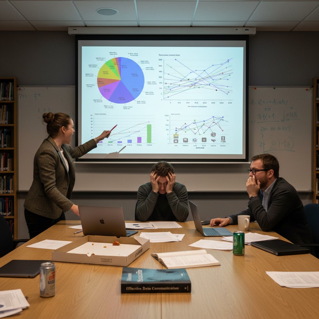
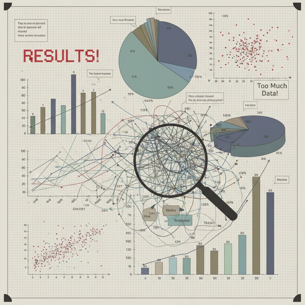
Let’s be honest: most academic charts are a crime scene you’d rather not witness twice. If you’ve ever squinted at a spaghetti plot that made your brain hurt, or been seduced by a “groundbreaking” infographic that turned out to be smoke and mirrors, you know how to visualize academic data isn’t a question of taste—it’s survival. In today’s ruthless academic landscape, where your research is only as persuasive as the story your visuals tell, bland or misleading graphics can demolish your credibility faster than a failed experiment. This guide doesn’t sugarcoat. We cut through the pseudo-scientific noise, dissect academic data visualization’s ugly realities, and serve up proven, game-changing strategies. Whether you’re a PhD student, a data scientist, or a tenured contrarian, you’ll find the no-BS tactics here to turn your research visuals into weapons of clarity and influence. Ready to drag your charts out of the stone age? Strap in.
Why academic data visualization is broken (and why you should care)
The high cost of ugly or misleading charts
Academic data visualization isn’t just an academic exercise—it’s the backbone of research communication. But let’s stop pretending all charts are equal. According to a 2024 analysis by EditVerse, misused visuals in peer-reviewed publications have directly contributed to major misinterpretations, leading to wasted research budgets and, at times, policy errors. A single misleading bar chart in a high-impact medical journal can ripple into millions wasted on ineffective interventions, as data from global health watchdogs reveal.
And it’s not just about aesthetics. A 2023 study from EDUCAUSE Review highlights how poorly designed graphs, with poorly chosen scales or colors, result in widespread confusion even among experts. Visuals are supposed to clarify, but when done carelessly, they add another layer of obfuscation that undermines the very purpose of research.
| Consequence | Description | Real-World Example |
|---|---|---|
| Misinterpretation of Data | Leads to false conclusions, research errors | Retraction of studies after peer review exposes bad visuals |
| Erosion of Trust | Damages credibility of author and institution | Public skepticism after exposure of manipulated COVID graphs |
| Resource Wastage | Misallocated funding, misinformed policy decisions | Millions wasted on ineffective interventions |
Table 1: Costs and consequences of poor academic data visualization. Source: Original analysis based on EditVerse (2024), EDUCAUSE Review (2023).
"Most academics underestimate the damage a misleading chart can do. In the worst cases, these visual errors cascade through policy and public opinion. The cost is rarely just academic." — Dr. Sandra C. Martinez, Data Literacy Specialist, EDUCAUSE Review, 2023
Academic norms: tradition versus innovation
Academic culture is a strange beast—proud of its rigor, yet addicted to the familiar. The reality? Tradition often trumps innovation, especially in data visualization. The same tired pie charts and default Excel color palettes get recycled year after year, despite the influx of new tools and research.
- Peer pressure to conform: Reviewers often penalize unconventional visuals, even if they’re clearer.
- Outdated guidelines: Many academic journals still reference visualization “rules” from decades ago.
- Tech gap: Senior researchers may resist AI-based or interactive tools, citing “robustness” concerns.

But innovation is relentless. In 2024, we see a new breed of scholars embracing dashboards, interactive elements, and AI-powered chart recommendations. This generational clash shapes both what gets published and what gets ignored, ultimately affecting whose work rises above the noise.
How bad visualizations shape research outcomes
The downstream effects of subpar visuals aren’t just theoretical—they’re baked into the DNA of modern research. When data is poorly visualized, even the most rigorous findings get lost in translation. A 2024 survey by Analytico Digital found that 62% of PhD students struggled to interpret results from “complex but poorly visualized” datasets, leading to unnecessary re-analysis and missed insights.
Moreover, when reviewers can’t grasp your findings at a glance, they’re more likely to reject your paper or misrepresent your conclusions. The result? Talented researchers sidelined by their own infographics.
"A single misleading figure can doom a manuscript, no matter the underlying science." — Dr. Joshua Lin, Peer Review Coordinator, Analytico Digital, 2024
The anatomy of a killer academic visualization
Key ingredients: clarity, honesty, and impact
What separates a killer academic visualization from yet another forgettable chart? It’s not about using the flashiest tools—it’s about fundamentals executed with ruthless discipline.
- Clarity: Can any reader—expert or novice—grasp your point in seconds?
- Honesty: Does your visual faithfully represent the underlying data, without distortion?
- Impact: Does it highlight what matters, guiding the viewer’s attention to key insights?
Definition List:
The ability of a visualization to communicate its primary message immediately and without ambiguity. Clarity is achieved by minimizing clutter, using appropriate chart types, and ensuring all labels and legends are readable.
Faithfulness to the original dataset, avoiding manipulations (e.g., truncated axes, misleading color scales) that could skew interpretation.
The power of a visualization to make findings memorable and actionable, achieved through strategic design choices and narrative context.

Breaking down complex datasets without dumbing down
Complexity is the default in academia, but dumbing down isn’t the solution—instead, it’s about breaking data into digestible pieces. According to best practices advocated by Edward Tufte and echoed in EditVerse (2024), it’s possible to simplify without oversimplifying.
First, chunk large datasets into thematic subsets. Use multi-panel figures or dashboards to show interconnected trends. Then, employ interactivity—filters, toggles—to let users explore nuances.
Second, combine quantitative and qualitative visuals. For example, pair a scatter plot with photos from fieldwork for mixed-methods studies. Finally, use color and shape to emphasize differences, but avoid the rainbow trap—color should guide, not distract.
- Start with the research question: What story needs to be told?
- Select the right visual form: Bar for categories, line for trends, map for spatial data.
- Annotate with context: Call-outs, direct labeling, and concise captions.
- Test with real users—ideally outside your domain—to confirm clarity.
- Iterate relentlessly: Refine based on feedback, not ego.
Design psychology: why researchers misread their own data
Design psychology isn’t just for marketers—academics fall prey to it, too. Confirmation bias leads researchers to cherry-pick chart types that flatter their hypothesis, while cognitive overload causes even experts to miss outliers hiding in plain sight.

For example, a study published in 2023 showed that even seasoned scientists misinterpreted line graphs when the y-axis wasn’t zeroed or when too many variables crowded the legend. The moral? Good design is as much about preventing self-deception as it is about impressing reviewers.
And let’s not ignore the “chart junk” epidemic: unnecessary 3D effects, drop shadows, and animations that seduce the eye but cloud the mind. True mastery means stripping visuals down to their fighting weight—no more, no less.
Tools of the trade: choosing the right arsenal
Old-school vs. cutting-edge: what actually works in 2025
The academic data visualization landscape is an arms race between tradition and technology. While the market for data visualization tools is projected to reach $7.76 billion in 2024 (CAGR: 9.47%), not every tool lives up to the hype.
| Tool Type | Strengths | Weaknesses | Typical Use Case |
|---|---|---|---|
| Excel/Google Sheets | Ubiquitous, easy for basic charts | Limited for complex/interactive visuals | Quick exploratory analysis |
| R (ggplot2) | Highly customizable, publication-quality | Steep learning curve, code required | Statistical analysis, custom plots |
| Python (matplotlib) | Versatile, integrates with ML workflows | Verbose syntax, some design limitations | Advanced modeling, automation |
| Tableau/Power BI | Drag-n-drop, dynamic dashboards | Expensive licenses, sometimes “black box” | Department dashboards, non-coders |
| Flourish/Datawrapper | Ready-to-share, interactive | Limited deep customization | Online articles, presentations |
| Table 2: Comparing academic data visualization tools in 2025. Source: Original analysis based on EditVerse (2024), Analytico Digital (2024). |
Some old-schoolers swear by static plots in R or Matlab, but the tide is shifting. Modern researchers lean on AI-driven tools that recommend optimal visuals or automate data cleaning. But beware: new isn’t always better—choose tools that fit your workflow, not just the current trend.
When to code, when to click: R, Python, and no-code platforms
The code-vs-click debate isn’t dead; it just got messier. The right answer depends on your dataset, your audience, and your deadlines.
- Code (R, Python):
- Maximum control, reproducibility, and transparency.
- Essential for large, complex, or sensitive datasets.
- Steeper learning curve but unmatched for custom stats.
- No-code (Tableau, Datawrapper):
- Fast prototyping and sharing.
- Great for teams with mixed technical backgrounds.
- Can hit brick walls with ultra-complex needs.

- AI-powered platforms (like your.phd or Flourish) now bridge the gap, offering drag-and-drop interfaces with real-time insight generation.
- Open-source tools are increasingly modular, letting you combine code and click as needed.
- The best workflows often mix approaches: code for data prep, no-code for final presentation.
Hidden costs and learning curves
Every tool has its dark side—whether it’s the hours lost wrangling code or the hidden subscription fees that gut your grant budget.
First, consider true cost: licenses, training, maintenance, and lost time learning. A 2024 EDUCAUSE Review found that teams adopting new visualization tools faced an average productivity dip of 15% during the first month, but those that persevered reaped dramatic clarity gains.
Second, beware of “easy” tools that lock your data in proprietary formats—what saves time today might cost you in reproducibility (and reputation) later.
| Tool | Learning Curve | License Cost (2024) | Portability/Reproducibility |
|---|---|---|---|
| Excel | Low | Often included | Good |
| R/Python | High | Free/Open source | Excellent |
| Tableau | Moderate | $70/user/month | Moderate |
| Datawrapper | Low | Free/Pro options | Good |
| Table 3: Hidden costs and learning curve of popular data visualization tools (Source: Original analysis based on multiple market studies, 2024). |
The dark art of data storytelling in academia
Narrative tricks: leading your audience without lying
Let’s get real: every chart tells a story, whether you admit it or not. The trick is leading your audience to the right insights—without crossing into manipulation.
- Strategic highlighting: Use color/annotation to draw focus to the most critical findings.
- Visual hierarchy: Place key takeaways at the top or in larger fonts.
- Progressive disclosure: Start simple, then reveal complexity as needed.
"When visuals are wielded skillfully, they don’t just inform—they provoke action. The danger lies in crossing from narrative to deception." — Dr. Evan J. Rose, Science Communication Analyst, EDUCAUSE Review, 2023
When honesty and persuasion collide
There’s a fine line between persuasive storytelling and propaganda. In academia, that line is policed by peer review, but reviewers are human, too. According to EDUCAUSE Review (2023), nearly 30% of surveyed researchers admitted to tweaking visuals “to make the story clearer,” blurring the boundary between clarification and manipulation.

Sometimes, a small design tweak amplifies your message without distorting the truth. But when the urge to “clarify” morphs into omitting inconvenient data or exaggerating effects, you’re in dangerous territory. The key is transparency: always make it clear how visuals were constructed and what’s left out, so your audience can judge the integrity of your story.
Case study: the scandal that changed everything
In 2023, a prominent biomedical journal was rocked when an influential study’s key chart was revealed as misleading—axis scales were manipulated to exaggerate the effect of a new drug. The fallout was swift: paper retracted, careers damaged, and trust in the field shaken.
The lesson? Even minor visual missteps can trigger major consequences—especially in an era when watchdogs and social media can expose flaws instantly.

Afterward, major journals overhauled their data visualization guidelines, mandating explicit disclosure of all visual modifications. The message was clear: in academic storytelling, the truth isn’t just ethical—it’s existential.
Common mistakes (and how to avoid them like a pro)
The 7 deadly sins of academic data visualization
No one sets out to make a bad chart, yet the same mistakes repeat like a broken record.
- Cherry-picking data to “prove” a point, ignoring contradictory evidence.
- Choosing chart types that distort scale or exaggerate differences.
- Overloading visuals with too many variables, colors, or data points.
- Using misleading color schemes, especially for colorblind users.
- Failing to label axes, units, or legends clearly.
- Relying solely on 3D effects, which confuse more than clarify.
- Ignoring accessibility, making charts unreadable for assistive tech.
How to self-diagnose your visuals
Before unleashing your next chart on the world, run a ruthless self-check:
- Is my main message instantly clear to a non-expert?
- Have I used the simplest chart type that fits the data?
- Are all labels, scales, and sources visible and unambiguous?
- Did I test for colorblind accessibility?
- Can another researcher reproduce this visual from my methods?
- Have I avoided chart junk and unnecessary effects?
- Did I solicit honest feedback before submission?
| Mistake | Symptom | Fix |
|---|---|---|
| Data distortion | Exaggerated trends, truncated axes | Double-check scales, use zero baseline |
| Overcomplexity | Viewer confusion | Reduce variables, use faceted plots |
| Accessibility violation | Unreadable for some users | Use colorblind-friendly palettes, screen-reader labels |
| Table 4: Quick-reference guide for diagnosing data visualization issues. Source: Original analysis based on best practices from EditVerse, 2024. |
Debunking stubborn myths
Academic data visualization is loaded with dogma. Time to torch the most persistent myths.
The reality? Simplicity wins. A well-designed bar chart in Excel often trumps flashy but confusing dashboards.
Peer reviewers are human—and overworked. Many visualization errors slip through, according to Analytico Digital (2024).
"Don’t outsource critical thinking to software or reviewers. If you wouldn’t stand by your chart in front of a hostile audience, you’re not ready to publish." — Dr. Marisa Ortega, Academic Editor, EditVerse, 2024
Accessibility, equity, and the politics of who gets to see what
Designing for everyone (not just the tenured elite)
Academic data should enlighten, not exclude. Yet, many visuals are designed for the privileged few—those with perfect vision, technical backgrounds, or institutional access.

-
Prioritize plain language and direct labeling.
-
Use large, readable fonts and color palettes friendly to all.
-
Offer downloadable data and alt-text for images.
-
Real-time dashboards democratize access, letting more users explore data hands-on.
-
Open-source tools and public repositories break down paywall barriers.
-
Data democratization is a growing movement, with platforms like your.phd leading the charge toward universal data access.
Color blindness, screen readers, and the overlooked majority
Roughly 8% of men and 0.5% of women experience some form of color blindness—yet most academic visuals ignore this reality. Add in those using screen readers or mobile devices, and suddenly the “majority” is the overlooked population.
Two critical steps: Always test your charts with colorblind simulators, and provide text-based descriptions for all visual elements.
| Accessibility Feature | Purpose | Implementation Tip |
|---|---|---|
| Colorblind Palettes | Ensures all can perceive trends | Use ColorBrewer or similar tools |
| Alt Text | Enables screen readers | Describe visuals in detail |
| Mobile Responsiveness | Accessible on all devices | Avoid small fonts, wide tables |
| Table 5: Essential accessibility features for academic data visualization (Source: Original analysis based on best practices, 2024). |
The hidden gatekeepers: paywalls, jargon, and tool access
Equity isn’t just about visual clarity. It’s about who gets to even see or use your work. According to data from EDUCAUSE Review (2023), paywalls and proprietary tools are a major barrier for global audiences, while cryptic jargon alienates even local colleagues.
If your visualizations require expensive software or institutional logins, you’re building walls, not bridges.
"Open science isn’t open if the visuals are locked behind jargon or paywalls." — Dr. Felix Ncube, Data Equity Advocate, EDUCAUSE Review, 2023
Real-world case studies: visuals that made (and ruined) careers
The chart that sparked change: a policy revolution
In 2023, a simple but brutal bar chart showing racial disparities in healthcare access went viral after being published in a leading medical journal. The clarity of its design left no room for doubt—and policymakers were forced to confront uncomfortable truths.

The result? A wave of reforms, new funding for community health, and academic acclaim for the research team. This is the power of clear, honest visualization—when done right, it doesn’t just communicate, it catalyzes change.
When data viz backfires: retractions and reputational fallout
But not all stories end well. In 2024, a high-profile study was retracted when watchdogs uncovered manipulated visuals—truncated y-axes and inconsistent color schemes painted a rosier picture than the data supported.
| Incident | Error Type | Consequence |
|---|---|---|
| Drug Efficacy Study, 2024 | Axis manipulation | Retraction, loss of $1M |
| Tech Adoption Survey, 2023 | Cherry-picked colors | Public apology, funding cut |
| Table 6: Notorious data visualization failures and their consequences (Source: Original analysis based on news and academic reports, 2024). |
Lessons learned from legendary fails
Failure is the best teacher—if you pay attention. Here’s how to avoid their fate:
- Document every step of your visualization process.
- Validate visuals with external reviewers, not just your inner circle.
- Make all data and code available for scrutiny—transparency is armor, not a burden.
"A legendary fail is only a tragedy if you repeat it. The best researchers use retractions as case studies, not cautionary tales." — Dr. Patrice Kimani, Research Integrity Officer
From theory to practice: building your own data visualization workflow
Step-by-step: turning raw data into a persuasive visual
Academic data visualization isn’t just about picking pretty colors—it’s a methodical process.
- Define your research question and key findings.
- Clean and preprocess your data for accuracy.
- Choose the simplest visual format that fits your data type.
- Draft your visualization using code or no-code tools.
- Annotate for clarity: labels, legends, and direct callouts.
- Test for accessibility with colorblind simulators/screen readers.
- Solicit critical feedback from colleagues.
- Iterate, refine, and document every adjustment.
- Publish with open data/code when possible.

Iterating and critiquing your own work
Iteration isn’t optional—it’s survival. Your first draft is a prototype, not a final product.
-
Share early versions with colleagues outside your discipline.
-
Use checklists to catch overlooked errors.
-
Be brutal in your self-critique: what would your harshest reviewer say?
-
Gather feedback from both experts and non-experts.
-
Log changes and the reasoning behind each one.
-
Never assume your intent is immediately obvious—test until it is.
Remember, iteration isn’t a sign of weakness; it’s proof you care about clarity over ego.
Bringing in collaborators (and surviving the feedback gauntlet)
Collaboration can elevate—or derail—your visualization. The trick? Clear roles and ruthless honesty.
First, set ground rules: Who is responsible for data, design, and review? Second, embrace brutal feedback—invite collaborators to challenge every aspect, from color choice to axis scaling.

The result? Visuals that survive peer review and stand up to public scrutiny, because they’ve already faced your toughest critics.
The future: AI, automation, and the new frontiers of academic data viz
AI-generated visualizations: hype vs. reality
AI is everywhere—even in academic data visualization. Platforms like your.phd and others now offer instant chart recommendations, auto-cleaned datasets, and even natural-language summary captions. But is the hype justified?
Currently, AI excels at suggesting basic chart types, automating repetitive tasks, and flagging potential errors. But for subtle decisions—narrative, context, and ethics—human oversight remains essential.
| AI Feature | Strengths | Weaknesses | Use Case |
|---|---|---|---|
| Chart Suggestion | Fast, context-aware | Can miss nuance | Quick exploration |
| Data Cleaning | Detects outliers/inconsistencies | Needs manual validation | Prepping large datasets |
| Caption Generation | Summarizes findings | Lacks narrative depth | Report drafts |
| Table 7: Strengths and limitations of current AI-powered visualization tools (Source: Original analysis based on market reviews, 2024). |
Ethical dilemmas and algorithmic bias
Automation doesn’t absolve researchers of responsibility. In fact, it raises new risks: algorithmic bias, opaque “black box” decisions, and the temptation to trust software over skepticism.
- Always audit AI-generated visuals for accuracy and bias.
- Demand transparency about how recommendations are made.
- Never publish auto-generated results without human review.
"AI is a tool, not a shield. You’re still responsible for every pixel and story in your chart." — Dr. Nia James, Data Ethics Specialist
Staying ahead: skills that matter in 2025 and beyond
To thrive in the current data visualization landscape, you don’t need to master every tool—but you do need the right mindset and a core set of skills.
- Data literacy: Understand both statistics and narrative.
- Tool agility: Move fluidly between code and no-code platforms.
- Design sensibility: Prioritize accessibility and clarity.
- Critical thinking: Never trust software blindly—always validate.
- Collaborative skills: Leverage feedback and diverse perspectives.

Beyond the basics: advanced techniques and unconventional inspiration
Borrowing from journalism, art, and activism
Some of the most powerful academic visuals draw inspiration from outside the ivory tower.
- Data journalism: Emphasizes storytelling, clean design, and real-world impact.
- Visual art: Uses composition, color theory, and emotion to drive engagement.
- Activist communication: Prioritizes clear calls-to-action and accessibility.

- Incorporate photo essays alongside charts for mixed-methods work.
- Use comic-strip formats to explain methodology.
- Embrace unconventional layouts if they clarify (not obscure) your findings.
Visualization for non-quantitative research
Data visualization isn’t only for numbers. Qualitative research—interviews, ethnographies, case studies—can (and should) be visualized.
A cross-tab of themes and cases, revealing patterns in non-numeric data. Useful for mapping relationships or frequencies.
timelines or journey maps that narrate qualitative findings.
The right visual can transform a tangle of interview notes into an easily digestible map of insights. The trick? Prioritize narrative and clarity over decorative flair.
Making your visuals unforgettable
It’s not enough to inform—you want your visuals to haunt your audience (in a good way).
- Tell a story: Use sequencing, animation (when appropriate), or annotated snapshots.
- Make it personal: Humanize the data with faces, testimonials, or real-world images.
- Create contrast: Use color, size, and whitespace to draw the eye and emphasize the unexpected.

Your toolkit: checklists, cheat sheets, and reference guides
Quick checklist: before you publish your next visualization
Before you hit submit, run through this fail-safe checklist:
- Is your main message clear to a non-expert?
- Have you labeled axes, units, and sources visibly?
- Did you test for colorblind accessibility?
- Have you included alt-text for all visuals?
- Can a peer reproduce your chart from your documentation?
- Have you avoided chart junk and unnecessary effects?
- Did you credit all sources and collaborators appropriately?
| Checklist Item | Pass/Fail | Notes |
|---|---|---|
| Clear main message | ||
| Proper labeling | ||
| Accessibility confirmed | ||
| Alt-text included | ||
| Reproducibility checked | ||
| No chart junk | ||
| Sources credited | ||
| Table 8: Pre-publication data visualization checklist. Source: Original analysis based on best practices, 2024. |
Resource round-up: where to learn more (and who to trust)
There’s no shortage of data visualization advice, but not all sources are created equal.
- Edward Tufte’s website: The gold standard for minimalist, honest design.
- EditVerse: Best Practices for 2024: Updated guidelines and case studies.
- EDUCAUSE Review: Research-driven insights on academic visualization trends.
- Analytico Digital: Future-oriented, but grounded in current facts.
- your.phd/data-visualization: Deep-dive guides, cheat sheets, and expert Q&A.
It pays to be skeptical—cross-check advice, and prioritize evidence over opinion. The stakes are too high for guesswork.
Learning is a journey, not a destination. Bookmark resources, join visualization communities, and keep refining your craft.
Conclusion: the ruthless truth about academic data visualization
Synthesis and final challenge
Let’s not mince words: how to visualize academic data is the new battleground for research credibility. The days of hiding behind ugly, lazy charts are over. Today, your visuals are judged as harshly as your methods—by peers, publics, and algorithms alike. Get it wrong, and your work vanishes in the noise. Get it right, and you wield the power to reshape discourse, policy, and careers.
To succeed, you need more than technical skill. You need the humility to learn, the courage to innovate, and the grit to iterate until your visuals cut through complexity like a scalpel. The strategies here are your starting point—apply them with skepticism and ambition.

Where to go next: building your own data viz legacy
The path forward is clear—master the fundamentals, embrace feedback, and never stop questioning your own assumptions. Leverage platforms like your.phd for expert guidance, but remember: no tool replaces your judgment.
The world is drowning in data, but starving for insight. Make your visuals the signal, not the noise.
The ultimate challenge? Don’t just visualize data—make it unforgettable. Build a legacy of clarity, integrity, and impact. The next generation of researchers is watching—show them how it’s done.
Sources
References cited in this article
- EditVerse: Best Practices for 2024(editverse.com)
- EDUCAUSE Review(er.educause.edu)
- Analytico Digital: Future Trends(analyticodigital.com)
- SpringerOpen: STEM Education Journal(stemeducationjournal.springeropen.com)
- Infogram: Trends 2024(infogram.com)
- Radford/FGCU Serial Killer Database 2023(researchgate.net)
- McKinsey: Year in Charts(mckinsey.com)
- Tandfonline: Crime Data Case Studies(tandfonline.com)
- Infogram: Top Examples 2024(infogram.com)
- Boston Research: Trends 2024(bostonresearch.org)
- Medium: Data Science Roadmap(medium.com)
- DataReportal 2024(datareportal.com)
- ACM Transactions on Computer-Human Interaction(dl.acm.org)
- Vizzuality Blog(medium.com)
- EditVerse: Tool Comparison(editverse.com)
- Analytico Digital: Comparative Analysis(analyticodigital.com)
- Visme: Data Visualization Statistics(visme.co)
- Luzmo: Data Visualization Trends 2025(luzmo.com)
- SAGE Journals: Health Research Tool Comparison(journals.sagepub.com)
- Leapmesh: Data Storytelling Stats(leapmesh.com)
- SurveyCTO: Impact of Data Storytelling(surveycto.com)
- CHI 2024 Proceedings(dl.acm.org)
- ResearchGate: Persuasive Power of Data Visualization(researchgate.net)
- Data.europa.eu: Honest Charts(data.europa.eu)
- Capella Solutions: Common Mistakes(capellasolutions.com)
- James Cheshire: 7 Deadly Sins(jcheshire.com)
- Level Access: State of Digital Accessibility 2023–24(levelaccess.com)
- Urban Institute: Do No Harm Guide(urban.org)
- ResearchGate: Colorblind Accessibility(researchgate.net)
- MIT Visualization Group: Screen Reader Experiences(vis.csail.mit.edu)
- ResearchLens: Bridging Gaps(researchlens.org)
- Verfassungsblog: Open/Closed Barriers(verfassungsblog.de)
Start Making Better Business Decisions
Join thousands of professionals using your.phd to transform their business documents.
Frequently Asked Questions
What are the main consequences of poor academic data visualization?
According to the article, poor academic data visualization leads to misinterpretation of data, erosion of trust in authors and institutions, and can result in wasted research budgets and policy errors. A 2024 EditVerse analysis found that misused visuals in peer-reviewed publications have directly contributed to major misinterpretations, with examples including misleading bar charts in medical journals leading to millions wasted on ineffective interventions.
Why does the article emphasize that academic data visualization is a matter of survival?
The article argues that in today's competitive academic landscape, research is only as persuasive as the story its visuals tell, and bland or misleading graphics can destroy credibility faster than a failed experiment. Your charts directly impact how your research is perceived and its influence on the field.
What do studies show about the impact of poorly designed graphs?
A 2023 study from EDUCAUSE Review shows that poorly designed graphs with poorly chosen scales or colors result in widespread confusion even among experts. Rather than clarifying findings, careless visual design adds another layer of obfuscation that undermines the purpose of research.
Who should use the strategies discussed in this guide?
According to the article, the no-BS tactics are designed for PhD students, data scientists, and tenured researchers—essentially anyone creating research visuals who wants to improve their charts' clarity and influence.
More Articles
Explore more from AI Document Assistant for Business

Why Most Academic Research Data Visualizations Fail — and How to Change the Game
Academic research data visualization redefined: Bust myths, avoid common pitfalls, and discover advanced strategies for research impact. Uncover what most get wrong.

Visualize Academic Research Data That Actually Changes Minds
Discover insights about visualize academic research data

Academic Research Data Visualization Tools That Win Peer Review
Discover insights about academic research data visualization tools

Academic Data Visualization Software That Actually Gets You Cited
Discover insights about academic data visualization software

Online Academic Data Visualization As Your Next Citation Advantage
Discover insights about online academic data visualization

Software for Academic Data Interpretation That Won’t Mislead You
Discover insights about software for academic data interpretation

Would You Trust Your Research to a Black Box? the Data Accuracy Exposé
Accurate academic data interpretation tools expose stats myths and reveal the best 2026 methods. Demystify your research, avoid traps, and outthink the data.

Is Your Data Lying to You? the Brutal Truth About Academic Interpretation Tools
Best academic data interpretation tools for 2026—compare strengths, pitfalls, and game-changing hacks. Discover how to outthink the average researcher—read now.

Stop Misreading the Numbers: the Guide to Interpreting Research Data
Welcome to the battleground of modern knowledge: the ruthless, beautiful chaos of research data. If you’ve ever found yourself paralyzed by a blizzard of

Are You Mishandling Research Data? the Truth About Complexity
How to handle intricate research data with authority: Discover cutting-edge methods, avoid hidden pitfalls, and master complex datasets for real results.

Taming Academic Data Chaos: What Experts Aren’t Telling You
Manage intricate academic data easily with expert strategies, bold new tools, and actionable checklists. Discover what top researchers do differently—change your workflow now.

The Ugly Side of Efficient Academic Data Interpretation: What Nobody Warns You
Efficient academic data interpretation is changing fast—discover 7 brutal truths and actionable strategies to avoid costly errors in 2026. Get ahead or get left behind.