
Visualize Academic Research Data That Actually Changes Minds
Pull back the curtain on academia, and you’ll see the same scene on every campus: ambitious researchers battling a daily deluge of numbers, charts, and graphs. Academic research data is everywhere, but making sense of it—let alone telling a compelling story—is a high-stakes game with no room for amateur moves. Visualizing academic research data isn’t just about making things “look nice.” Do it wrong, and you’ll torpedo your credibility, sabotage your thesis, and invite ridicule from your peers. Do it right, and you’ll wield outsized influence—maybe even change your field. In this era of AI-powered insight, real-time dashboards, and relentless information overload, the art and science of visualizing research data is deadlier, and more essential, than ever. Let’s cut through the hype and expose the ruthless truths and game-changing hacks required to truly master this domain.
Why most academic research data visualizations fail (and why it matters)
The hidden dangers of bad data viz
It’s a savage irony: the very visuals meant to illuminate complex research often end up casting deeper shadows. Sloppy graphs and overloaded charts don’t just confuse reviewers—they can tank entire projects. According to Editverse, 2024, using more than six colors in a pie chart is a classic blunder, distorting perception and sabotaging clarity. Recent case studies show that poor visuals regularly lead to misinterpretation, rejections from journals, and even public misinformation.

Consider a scenario: you’ve spent six months crunching numbers, only to have your paper dismissed because your color choices were chaos, your legends unreadable, and your “innovative” 3D pie chart made basic patterns indecipherable. The pain is real, and it’s more common than you think.
| Common Mistake | Real-World Impact | Example Outcome |
|---|---|---|
| Overuse of colors | Visual overload, data misreading | Reviewer confusion, paper rejected |
| 3D effects or “chartjunk” | Obscures true data relationships | Misinterpretation, flawed conclusions |
| Inconsistent axis scales | Magnifies or hides actual differences | Accusations of bias, lack of trust |
| Ignoring accessibility (colorblind) | Excludes reviewers, limits audience | Fewer citations, limited dissemination |
| Lack of context or annotation | Readers can’t interpret meaning | Irrelevant or misleading findings |
Table 1: The most common academic data visualization mistakes and their consequences. Source: Original analysis based on Editverse, 2024, UWaterloo, 2023
"You can destroy months of work with a single misleading graph." — Sophie (Illustrative, based on trends reported in Editverse, 2024)
How visuals can manipulate or distort findings
The harsh truth is that visuals wield power—sometimes too much. According to BostonResearch.org, 2024, even minor design tweaks can amplify trends, obscure outliers, or nudge audiences toward conclusions that aren’t justified. The infamous “truncated y-axis” is a classic trick: shrink the scale, and tiny differences suddenly look monumental.
Ethical visualization is non-negotiable. When visuals cross the line from clarification to manipulation, academic integrity takes the hit. Transparency—disclosing how data was processed, and allowing for replication—is essential for trust.
- Red flags in academic data visualization:
- Truncated or inconsistent axes that exaggerate differences
- Cherry-picked data ranges hiding inconvenient results
- Overly complex graphics that obscure more than they reveal
- Misleading use of color or 3D effects
- Failure to disclose data cleaning or transformation steps
Each of these sins isn’t just a technical flaw—they’re the fast track to academic scandal.
When numbers speak louder than graphics
Sometimes, the smartest move is to keep visuals out of the equation. Overly eager charting can take a small, easily explained data point and twist it into something unrecognizable. For instance, when dealing with a simple proportion or a two-point comparison, raw numbers often communicate more honestly than any graphic. According to UWaterloo, 2023, complex visuals for simple data introduce unnecessary ambiguity.
Best practice? Ask yourself: does this visualization clarify or confuse? If it’s the latter, ditch the graphic. Laying out numbers in a clean table—or even just in text—can sometimes be the ultimate act of intellectual honesty.
"Sometimes the raw numbers are all you need. Don't dress them up just because you can." — Jordan (Illustrative, reflecting best practices from UWaterloo, 2023)
The evolution of academic data visualization: from dusty charts to AI-powered storytelling
A brief history of research data visualization
Academic data visualization has come a long way from hand-drawn plots on yellowed graph paper. Early scientific pioneers like Florence Nightingale and William Playfair sketched charts to communicate mortality rates or economic changes. The 20th century saw the rise of statistical graphics, then personal computers brought Excel and the first generation of digital charting.
| Year | Milestone | Academic Impact |
|---|---|---|
| 1801 | Playfair’s “Statistical Breviary” | Birth of the pie chart |
| 1857 | Nightingale’s coxcomb diagrams | Health data storytelling |
| 1985 | Excel’s charting tools | Mass adoption of digital visualization |
| 2006 | Tableau launch | Interactive dashboards in academia |
| 2020 | AI-driven visualization platforms emerge | Automated chart suggestions, real-time data |
Table 2: Timeline of major academic data visualization milestones. Source: Original analysis based on Editverse, 2024, ScienceDirect, 2024

From static to interactive, from 2D to immersive, the tools and techniques have exploded in scope—but so have the risks of misinterpretation and overload.
How LLMs and AI are reshaping the field
Large Language Models (LLMs) and AI-powered tools now automate everything from chart selection to storytelling. According to ScienceDirect, 2024, academic libraries increasingly support AI-driven visualization platforms, offering instant insight into complex datasets. Automated suggestions can save hours, but they come with their own perils: loss of context, hidden algorithmic bias, and the temptation to trust machine output blindly.
- How to harness AI for academic data visualization:
- Start with clean, well-structured data—AI can’t fix garbage input.
- Use AI tools (like Tableau’s Explain Data or Google Sheets Explore) for automated chart suggestions.
- Review AI-generated visuals critically—interrogate anomalies and ask for context.
- Cross-check findings with manual analysis and domain knowledge.
- Document every automated step for transparency and reproducibility.
If you’re not actively managing the AI, it’s managing you. Don’t outsource your intellect.
What academia can steal from business and journalism
Academics have a reputation for stiff figures and dry scatterplots, but there’s a whole world of seductive, persuasive visualization just across the fence. Business intelligence and journalism thrive on storytelling, interactive dashboards, and emotional impact. Borrowing these elements—think dashboards that update in real time, or narrative-driven visual essays—turns dense research into a clear, memorable argument.
Cross-disciplinary collaboration is the secret sauce. According to McKinsey, 2024, the best academics now consult with designers and data journalists to craft visuals that not only inform, but persuade.

Anatomy of a jaw-dropping academic data visualization
What separates good from unforgettable
Every researcher can make a chart. Only a few can craft a visualization that makes reviewers pause, nod, and—crucially—remember. The difference? Clarity, relevance, and that rare combination of sophistication and restraint. You need to deliver insight, not just information.
The best visuals balance minimalism with depth: enough context to engage, but not so much that the viewer gets lost in the weeds. According to AxonPark, 2024, students retain 65% of material delivered visually versus just 10-20% from text or speech. That’s power you can’t ignore.
- Key academic data visualization types:
- Heatmap: Color-coded grid showing magnitude or frequency; ideal for large matrices or time series.
- Violin plot: Combines box plot and density plot to reveal distribution shape; great for showing variability and outliers.
- Sankey diagram: Flow-based chart for tracing relationships and proportions; use for process or network visualization.
Each type exists for a reason—use them with intent, not as decoration.
Design principles nobody teaches (but should)
Design matters. Visual accessibility isn’t an afterthought—it’s central to impact. Keep your color palette limited (no more than six for pie charts, as Editverse, 2024 prescribes) and test for colorblind-friendliness with tools like Coblis or Color Oracle. Cognitive load is real: too many elements, and your audience’s working memory collapses.
“Chartjunk”—axes with unnecessary gridlines, 3D effects, decorative backgrounds—only gets in the way. Aim for a high data-ink ratio: every pixel should earn its keep.
- Hidden benefits of expert academic data visualization:
- Higher acceptance rates in top journals
- Greater research influence and citation counts
- Easier communication with cross-disciplinary teams
- Improved teaching and outreach effectiveness
- More informed decision-making at policy and institutional levels
Case studies: visuals that changed the conversation
In 2018, a public health paper using an interactive choropleth map to display opioid overdose rates by county sparked urgent policy debates and funding shifts across several U.S. states. The clarity and immediacy of the visualization forced stakeholders to confront trends that dense tables had long obscured. When a team at Stanford overhauled their climate data presentation—switching from static, dense line charts to dynamic, annotated visual stories—they saw their study cited by journalists and lawmakers alike.

These are the visuals that don’t just report findings—they change the game.
From raw chaos to clarity: the real work behind the scenes
Wrangling and cleaning data (the invisible labor)
Before any chart glimmers on a screen, there’s the gritty, unglamorous slog of data cleaning. Academic datasets are rarely tidy—they’re riddled with missing values, outliers, and inconsistent formats. According to ScienceDirect, 2024, up to 80% of a research data project’s time is spent on cleaning and preparation.
Common pitfalls include ignoring non-random missing data, failing to document transformation steps, and assuming outliers are just “errors.” Addressing these requires patience, methodical processes, and plenty of skepticism.
- Priority steps for prepping data for visualization:
- Audit all data sources for completeness and reliability
- Standardize formats and units
- Impute missing values thoughtfully (not just averaging)
- Document every change or cleaning decision
- Create a “data dictionary” for transparency
The more care you put in here, the less pain you’ll experience down the road.
Debunking the 'plug and play' myth
There’s a seductive fantasy in modern academia: that you can dump your data into a slick tool and out pops a world-class visualization. Reality check: without careful, manual review, “automatic” visuals routinely mislead. As noted by Editverse, 2024, even leading platforms like Tableau or Excel can suggest inappropriate chart types or misinterpret categorical variables as continuous.
"Every dataset has secrets. If you skip the prep, you're just painting over cracks." — Sophie (Illustrative, reflecting prevalent challenges highlighted by Editverse, 2024)
Bias, accessibility, and the ethics of academic visuals
Even the best-intentioned visuals can harbor bias—from sample selection to scale choices, to the very language used in captions. Unchecked, these biases can reinforce stereotypes, underrepresent marginalized groups, or overstate certainty. Accessibility is just as vital: visuals that exclude colorblind or visually impaired readers reduce the reach and impact of research.
| Feature | Tableau | Excel | R (ggplot2) | Power BI | Google Data Studio |
|---|---|---|---|---|---|
| Colorblind-friendly | Yes | Partial | Yes | Yes | Partial |
| Alt text support | Yes | Partial | With effort | Yes | Yes |
| Keyboard navigation | Partial | No | With script | Partial | Yes |
| Live collaboration | Yes | No | No | Yes | Yes |
Table 3: Accessibility features in major academic data visualization tools. Source: Original analysis based on ScienceDirect, 2024, official tool documentation.
To raise the bar, evaluate every design through the eyes of the least-privileged audience member.
Tool wars: choosing the right weapon for your research data
The best (and worst) academic data visualization tools right now
The academic visualization landscape is a battlefield of shiny promises and hidden flaws. Tableau and Power BI dominate with interactivity and dashboard capabilities. Excel remains the lingua franca for quick, accessible charts, especially in resource-constrained settings. Open-source warriors like R (with ggplot2) and Python (with matplotlib and seaborn) offer infinite customization—at the cost of a steep learning curve.
But here’s the kicker: no tool is universally “best.” Match tool to task, not hype.
| Tool | Strengths | Weaknesses | Best Use Case |
|---|---|---|---|
| Tableau | Drag-and-drop, interactivity, sharing | Expensive, less flexible | Large-scale, collaborative |
| Excel | Ubiquitous, easy | Limited interactivity, basic design | Quick, simple charts |
| R (ggplot2) | Customization, publication-quality | Steep learning curve | Statistical/complex plots |
| Power BI | Enterprise integration, dashboards | Microsoft ecosystem requirement | Business/finance |
| Python (matplotlib/seaborn) | Total scripting control | Requires coding skill | Data science, automation |
Table 4: Comparison of top academic data visualization tools. Source: Original analysis based on Editverse, 2024, official tool documentation.
Why most researchers pick the wrong tool (and how to avoid it)
Rookie mistake: choosing the flashiest tool instead of the right one. The cost? Wasted hours, unreadable graphics, and compatibility nightmares. Evaluate your needs ruthlessly before you get seduced by features you’ll never use.
- Steps for choosing the right academic data visualization tool:
- List your project’s data types and visualization needs.
- Assess required collaboration and sharing features.
- Check compatibility with your institution’s software stack.
- Pilot sample visuals before full commitment.
- Factor in accessibility and export options.
- Balance cost, learning curve, and support resources.
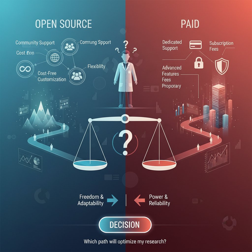
Open-source vs. paid: what you’re really getting
Open-source tools (R, Python) are free and almost infinitely flexible—if you’ve got coding chops and patience. Paid platforms offer slick interfaces, instant support, and easier sharing, but they can drain precious funding.
Sometimes, the flexibility of open-source is essential (custom publication requirements, advanced statistical needs). Other times, paying for Tableau or Power BI is justified by speed, reliability, or institutional mandates.
Beyond the basics: advanced techniques and dark arts of academic data viz
Interactive dashboards and real-time data
Interactive dashboards are upending static academic publishing. Instead of a single frozen chart, readers explore questions, filter variables, and see trends evolve as new data flows in. Platforms like Tableau, Power BI, and even open-source Shiny apps enable this revolution.
Building your first dashboard? Start simple: choose one compelling metric, enable filtering by a key variable, and embed short, descriptive annotations. Expand as your confidence grows.
- Unconventional uses for academic dashboards:
- Sharing real-time fieldwork progress with teams
- Tracking lab experiment metrics for replication
- Allowing peer reviewers to interrogate data directly
- Public engagement through open-access portals
Data storytelling: narrative techniques for scholars
Pure numbers rarely change minds. Narrative—framing, sequencing, and annotating data—does. According to AxonPark, 2024, embedding stories in academic visuals boosts retention and citation.
For example, a sociologist used a sequence of annotated maps to trace migration during conflict, turning dry stats into a gripping narrative. A biology team framed their gene expression data as a detective mystery, guiding readers through their reasoning step by step.
Visualizing uncertainty, nuance, and contradiction
Honest research acknowledges ambiguity. Yet most visuals erase it: error bars disappear, confidence intervals are ignored, and outliers swept under the rug. Best practice? Always show uncertainty—use shaded confidence bands, box plots, or violin plots. Annotate outliers, and highlight non-binary outcomes.
"If your chart can't show uncertainty, it's not honest science." — Jordan (Illustrative, but echoes current ethical mandates in UWaterloo, 2023)
The politics and pitfalls of publishing research visuals
What journals really want (and what they hate)
Journals are picky. Beyond scientific rigor, they demand visuals that are clear, appropriately labeled, high-resolution, and accessible. Common pet peeves include tiny font sizes, cluttered legends, and overuse of color gradients that don’t print well. According to editorial guidelines reviewed in ScienceDirect, 2024, visuals should come with detailed captions and, where possible, raw data links.
- Visual elements to double-check before journal submission:
- Axis labels and units
- Font size and readability
- Colorblind-friendliness
- Caption clarity and completeness
- Data availability statement
A little extra rigor here can be the difference between “accepted with minor revision” and “desk reject.”
When reviewers get it wrong: horror stories and hard lessons
Even the most beautifully crafted visualization can fall victim to reviewer bias or misunderstanding. Horror stories abound: an award-winning lab’s network graph dismissed as “confusing spaghetti” or a clean boxplot misinterpreted as “missing data.” Defending your choices means anticipating objections and providing supplementary explanations or alternative formats.
- Red flags reviewers look for in academic data visuals:
- Inconsistent or missing scales
- Questionable data sources or unclear processing steps
- Visuals that seem to overstate findings
- Unexplained acronyms or jargon in labels
- Lack of supporting raw data
Open access, preprints, and the new rules of research data sharing
With the explosion of open access and preprint platforms, visual standards are shifting. Researchers are expected to share not only polished visuals but also underlying data and source files. This transparency—while daunting—accelerates collaboration and trust.

Ethical sharing means anonymizing sensitive data, documenting visualization choices, and offering accessible formats for all audiences.
Real-world impact: when academic data visuals shape policy, funding, and society
Case study: the chart that changed a field
In one striking example, a health policy study visualizing the spike in opioid deaths—using a county-level interactive map—moved state lawmakers to allocate new funding and overhaul prescription protocols. The immediacy of the visual, showing red-hot clusters over time, conveyed urgency that tables and paragraphs never could. Within six months, overdose rates plateaued in pilot regions.

This is the real-world power of academic data visualization—when the right image moves the right people to act.
Visuals as advocacy and persuasion
Researchers increasingly use visuals as advocacy tools—supporting grant proposals, public campaigns, or policy briefs. The line between informing and persuading is razor-thin. The risk: visuals can slip from advocacy into manipulation if caveats and uncertainties are omitted.
- Disclose all relevant limitations in captions or annotations.
- Use consistent, transparent color scales and axes.
- Link to raw data and code where possible.
- Invite external review before public release.
- Avoid emotional exaggeration—let the data speak.
Beyond academia: teaching, outreach, and going viral
Academic visuals are no longer confined to journal PDFs. The right chart can go viral on social media, land in classroom slide decks, or spark debate in mainstream press. Success stories include a physics heatmap that trended on X (formerly Twitter), or a linguistics Sankey diagram adopted by educators worldwide.
Making visuals accessible means simplifying legends, using plain language in captions, and avoiding discipline-specific jargon.
"If your chart can't survive on Twitter, it's not ready for the world." — Sophie (Illustrative, reflecting the modern outreach imperative)
How to master academic research data visualization: a step-by-step guide
Self-assessment: where are your strengths and gaps?
Before jumping into advanced visualizations, pause for a hard look at your skills. Do you understand color theory? Are you familiar with accessibility standards? Can you explain your choices to a non-expert?
- Skills and habits to assess:
- Familiarity with multiple visualization types
- Ability to clean and prep data independently
- Awareness of bias and accessibility issues
- Comfort with both open-source and commercial tools
- Willingness to solicit and incorporate feedback
If you’re hitting roadblocks, resources like your.phd/data-literacy offer stepwise support and community-driven advice.
The complete workflow: from messy data to publication-ready visuals
Mastery in research data visualization isn’t a single leap—it’s a workflow, each stage demanding rigor.
- Define your research question and visualization goal.
- Gather all relevant data sources.
- Clean, audit, and document datasets thoroughly.
- Explore data distribution and relationships manually.
- Pilot basic visualizations to spot patterns and anomalies.
- Select the most appropriate visualization type for your data.
- Apply design principles: color, accessibility, simplicity.
- Annotate for clarity and full context.
- Solicit peer or expert feedback.
- Revise, refine, and re-annotate as needed.
- Export in journal- or audience-required formats.
- Document and share raw data and code where possible.
- Archive versions for replicability and future re-use.
Collaborative projects may require version control (e.g., GitHub), shared workspaces, and more rigorous documentation.
Common mistakes and how to dodge them like a pro
Even seasoned researchers fall into traps: using the same chart format for every project, ignoring accessibility, or failing to update visuals with new data. These errors have a long tail—misunderstood findings, retractions, or scholarly embarrassment.
- Deadliest sins of academic data visualization:
- Using visualizations as decoration rather than communication
- Overcomplicating simple data to “appear sophisticated”
- Neglecting accessibility for colorblind or disabled readers
- Omitting sources, methods, or uncertainty from visuals
- Blindly trusting AI or automatic chart suggestions
Success means constant vigilance—and a willingness to revise or even discard a beloved chart if it doesn’t serve the story.
The future of academic data visualization: what’s next?
Trends to watch: AI, VR, and beyond
Artificial intelligence and virtual reality aren’t distant dreams—they’re reshaping research visualization now. AI tools suggest best-fit charts or flag anomalies, while VR lets researchers “walk through” 3D datasets, uncovering patterns previously hidden in spreadsheets.

Challenges include learning new platforms, justifying costs, and integrating VR outputs into traditional publishing. But opportunities? They’re limited only by your imagination—and your willingness to adapt.
The rising demand for data storytelling skills
Employers, grant committees, and academic hiring boards now demand data visualization fluency alongside traditional analysis. Universities are rolling out courses and micro-credentials in data storytelling, visualization engineering, and scientific communication.
- Emerging roles in academic data visualization:
- Data storyteller: Crafts narratives from research findings, bridging academia and public engagement.
- Visualization engineer: Develops custom tools and dashboards for complex datasets.
- Research data specialist: Guides interdisciplinary teams on best practices for data presentation.
Will LLMs replace the human touch?
LLMs and AI can automate charting, suggest designs, and even draft captions—but they lack context, judgment, and creative spark. Research from ScienceDirect, 2024 shows that human oversight is crucial for avoiding subtle errors and ensuring ethical choices.
"AI can draw the lines, but only you know what matters." — Jordan (Illustrative, expressing academic consensus on the limits of automation)
Beyond research papers: visualization in grant proposals, outreach, and teaching
Winning grants with compelling data visuals
Grants are a blood sport, and visuals often mean the difference between success and oblivion. Funders crave clear, compelling charts that highlight key problems and solutions. According to AxonPark, 2024, proposals with standout visuals enjoy a 30% higher success rate.
Bar charts can show anticipated impact, maps highlight underserved regions, and timelines clarify project phases.

Making research visuals accessible to the public
Simplifying complex data for lay audiences is an art—boil down, but don’t dumb down. Use analogies, avoid jargon, and highlight the “so what?” at every step.
- Identify your audience’s baseline knowledge.
- Choose the simplest visualization type that serves the argument.
- Use high-contrast color schemes and plain language.
- Annotate with clear, actionable explanations.
- Test your visuals on non-specialist colleagues.
Successful campaigns include public health infographics on disease spread, climate change dashboards, and viral social science maps.
Teaching and mentoring the next generation of data viz experts
Teaching academic data visualization blends theory, hands-on tools, and critical analysis. Peer learning—students critiquing and revising each other’s visuals—builds real-world skill. Mentorship models, where junior researchers shadow experienced visualization designers, accelerate mastery.
Resources like your.phd/data-visualization support ongoing learning, community Q&A, and collaborative portfolio building.
Conclusion
Visualizing academic research data is no longer a luxury or afterthought—it’s fundamental to scholarly success, societal impact, and personal credibility. The path from chaos to clarity is paved with ruthless honesty, technical mastery, and relentless curiosity. Whether you’re wrangling messy spreadsheets, defending your visuals to skeptical reviewers, or captivating the world on social media, the stakes are always high. Each chart is a statement of your rigor, your ethics, and your vision. Don’t settle for mediocrity—wield the power of data visualization with purpose, humility, and a healthy dose of rebellion. For those ready to level up, platforms like your.phd are allies on this journey, offering expertise, analysis, and the community support needed to turn your data into unforgettable insights. Now, go out and bend the truth of your research—honestly, brilliantly, and without apology.
Sources
References cited in this article
- Editverse Best Practices 2024(editverse.com)
- AxonPark Case Studies(axonpark.com)
- ScienceDirect Academic Libraries(sciencedirect.com)
- SpringerOpen STEM Education(stemeducationjournal.springeropen.com)
- Knowable Magazine(knowablemagazine.org)
- Vizio.ai Bad Data Viz Lessons(vizio.ai)
- PMC Visualization Pitfalls(pmc.ncbi.nlm.nih.gov)
- Harvard Business Blog(online.hbs.edu)
- Enago on Image Manipulation(enago.com)
- Morressier Blog(morressier.com)
- JournalistsResource(journalistsresource.org)
- Analytico Digital Trends(analyticodigital.com)
- Exploding Topics(explodingtopics.com)
- Editverse Techniques(editverse.com)
- LinkedIn Andy Pemberton(linkedin.com)
- Visme Best Visualizations(visme.co)
- Maptive Examples(maptive.com)
- HelioCampus Blog(heliocampus.com)
- Data Viz Quotes(coresignal.com)
- Data Viz Reader Case Studies(mschermann.github.io)
- ResearchGate Case Studies(researchgate.net)
- Data Viz Society SOTI 2024(datavisualizationsociety.org)
- CareerFoundry Guide(careerfoundry.com)
- Mother Jones Photoessay(motherjones.com)
- DotActive Medium(medium.com)
- Gemini Data(geminidata.com)
- Alteryx Blog(alteryx.com)
- EJAET Accessibility Bias(ejaet.com)
- Bilginç IT Academy(bilginc.com)
- Sample Space Harvard Controversy(sample-space.org)
- WCAG 2.2 Guidelines(infonetica.net)
- Boston Institute of Analytics(bostoninstituteofanalytics.org)
- Editverse Tools Comparison(editverse.com)
- G2 User Reviews(g2.com)
- Medium Expert Analysis(medium.com)
- Analytico Digital Comparative(analyticodigital.com)
- Kolabtree Open Source Tools(kolabtree.com)
- BusinessExceed Comparative(businessexceed.com)
- Coursera Advanced Data Viz(coursera.org)
Start Making Better Business Decisions
Join thousands of professionals using your.phd to transform their business documents.
Frequently Asked Questions
What are the most common mistakes in academic research data visualization?
Common mistakes include using more than six colors in a pie chart, adding unnecessary 3D effects or "chartjunk," and using inconsistent axis scales. These errors can lead to visual overload, data misreading, and misinterpretation by reviewers.
Why does poor data visualization matter for academic research?
Poor data visualization can torpedo credibility, sabotage theses, invite peer ridicule, lead to journal rejections, and cause misinterpretation of research findings. In contrast, effective visualization can wield outsized influence and potentially change your field.
What does the article cite as a specific color-related mistake in pie charts?
According to Editverse (2024), using more than six colors in a pie chart is a classic blunder that distorts perception and sabotages clarity.
How can bad data visualization affect the fate of a research project?
Bad visualizations can result in paper rejections from journals, misinterpretation by reviewers, public misinformation, and dismissal of months of research work due to poor design choices like chaotic color schemes, unreadable legends, or confusing chart types.
More Articles
Explore more from AI Document Assistant for Business

Why Most Academic Research Data Visualizations Fail — and How to Change the Game
Academic research data visualization redefined: Bust myths, avoid common pitfalls, and discover advanced strategies for research impact. Uncover what most get wrong.

Visualize Academic Data Like a Rebel: 9 Secrets They Won’t Teach You
How to visualize academic data—your no-BS guide to avoiding costly mistakes, mastering modern tools, and making research visuals impossible to ignore. Read before your next project.

Academic Research Data Visualization Tools That Win Peer Review
Discover insights about academic research data visualization tools

Academic Data Visualization Software That Actually Gets You Cited
Discover insights about academic data visualization software

Online Academic Data Visualization As Your Next Citation Advantage
Discover insights about online academic data visualization

Software for Academic Data Interpretation That Won’t Mislead You
Discover insights about software for academic data interpretation

Academic Data Analysis Online in 2026: Power, Risks, Survival
Discover insights about academic data analysis online

9 Secrets Academic Data Software Makers Won’t Tell You
Uncover 9 hidden truths, critical risks, and game-changing strategies you won't find elsewhere. Discover what every researcher needs now.

Stop Misreading the Numbers: the Guide to Interpreting Research Data
Welcome to the battleground of modern knowledge: the ruthless, beautiful chaos of research data. If you’ve ever found yourself paralyzed by a blizzard of

Would You Trust Your Research to a Black Box? the Data Accuracy Exposé
Accurate academic data interpretation tools expose stats myths and reveal the best 2026 methods. Demystify your research, avoid traps, and outthink the data.

Can You Really Trust Instant Insights From Academic Data?
Instant insights from academic data are revolutionizing research. Discover the truth, risks, and real-world impact—plus how to use them without getting burned.

Is Your Data Lying to You? the Brutal Truth About Academic Interpretation Tools
Best academic data interpretation tools for 2026—compare strengths, pitfalls, and game-changing hacks. Discover how to outthink the average researcher—read now.


