
Software for Academic Data Interpretation That Won’t Mislead You
The line between insight and illusion is razor thin—and never more so than in today’s academic research. If you believe software for academic data interpretation is just a smarter spreadsheet, you’re in for a rude awakening. In 2025, the world of academic data analysis is less “quiet library” and more “data storm with sirens blaring.” AI, machine learning, and immersive visualization aren’t just buzzwords—they’re rewriting the rules of research, democratizing insight while quietly introducing new biases and challenges. The sheer scale of academic data, the proliferation of tools, and the very real risks of misinterpretation mean that every researcher, from doctoral candidates to seasoned analysts, must rethink not just how they interpret data, but why. Are your tools extracting meaning—or burying it? This is the story your professors won’t tell you: the hard truths, hidden pitfalls, and real-world strategies for mastering academic data interpretation software before it masters you.
The data deluge: Why academic interpretation will never be the same
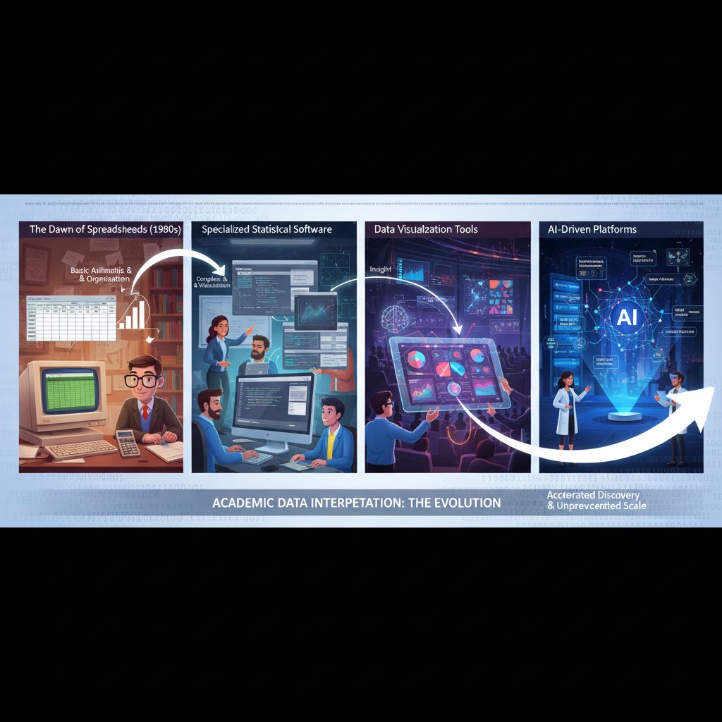
From spreadsheets to AI: A brief history of academic data tools
Academic data interpretation didn’t always mean wrangling terabytes in the cloud or parsing models built by generative AI. In the 1970s, the revolution started quietly with spreadsheets—VisiCalc and later Excel—giving researchers unprecedented control over their numbers. By the 1990s, statistical packages like SPSS and SAS took over, enabling complex analysis but still requiring a steep learning curve. The 2000s ushered in open-source tools like R and Python, fueling data science’s ascent. Fast forward to the 2020s, and generative AI, automation, and collaborative cloud platforms have made sophisticated analysis accessible—but also more opaque.
| Year/Decade | Key Tool/Innovation | Impact on Academic Data Interpretation |
|---|---|---|
| 1979 | VisiCalc, Lotus 1-2-3 | First digital spreadsheets, basic analysis |
| 1985 | Microsoft Excel | Popularized spreadsheets, greater adoption |
| 1990s | SPSS, SAS | Specialized stats, deep analysis, closed |
| 2000s | R, Python | Open-source, flexible, accessible |
| 2010s | Data visualization (Tableau) | Data storytelling, interactive exploration |
| 2020-2025 | AI/LLMs, cloud collaboration | Automated insight, scale, democratization |
Table 1: Timeline of major milestones in academic data interpretation software (1970s–2025).
Source: Original analysis based on Gartner, 2024, ScienceDirect, 2025.
This evolution isn’t just technological—it’s philosophical. What began as a quest for precision has become a battle for meaning, with each new wave of tools both illuminating and complicating the research landscape.
The scale problem: How much data is too much?
The digital floodgates are wide open. According to ScienceDirect (2025), the annual volume of academic publications and research data is growing at a rate that outpaces both computational resources and methodological capacity. In 2023, public school leaders reported that 32% of students lagged behind grade level in at least one subject—a data point only visible through advanced analytics (NCES, 2024). The challenge isn’t access; it’s interpretation.
| Discipline | Avg. Dataset Size (2020) | Avg. Dataset Size (2025) |
|---|---|---|
| Genomics | 50 GB | 700 GB |
| Social Sciences | 2 GB | 15 GB |
| Humanities | 500 MB | 5 GB |
| Physics/Astronomy | 10 GB | 120 GB |
| Education | 1 GB | 10 GB |
Table 2: Average dataset sizes by discipline (2020 vs. 2025).
Source: Original analysis based on ScienceDirect, 2025, NCES, 2024.
“We’re drowning in data, but starving for meaning.”
— Alex, data scientist
Behind these numbers lies a brutal reality: researchers face not just an ocean of information, but a mounting pressure to interpret it at breakneck speed, often with tools they barely understand. The risk of error—of missing the story that matters—has never been higher.
What’s at stake: When interpretation goes wrong
A single misstep in data interpretation can ripple through entire fields. In academic circles, a faulty analysis isn’t just a personal embarrassment—it can misguide policy, misallocate funding, and erode public trust in science. Consider the infamous “p-hacking” scandals or the retraction of high-profile studies due to flawed software pipelines. The stakes are existential.
- Misleading conclusions: Incorrect data interpretation leads to false findings, which can misdirect research for years.
- Policy blunders: Flawed analytics have informed misguided educational or health policies, wasting resources and time.
- Reputational damage: Institutions that publish erroneous or manipulated results face lasting loss of credibility.
- Wasted funding: Grants and investments are squandered on research built atop analytical sandcastles.
- Ethical breaches: Inadequate data governance risks privacy violations and consent breaches.
- Data loss: Poor software practices can irretrievably destroy months—or years—of work.
- Public mistrust: High-profile misinterpretations fuel skepticism towards science and academia.

Each point above is not hypothetical; it’s grounded in a reality witnessed repeatedly in recent years, underscoring the urgent need for robust, transparent, and user-friendly interpretation tools.
Decoding the options: The current landscape of software for academic data interpretation
The big players: Who’s actually leading the field?
The 2025 software landscape is a fierce battleground. Giants like IBM SPSS, SAS, and Stata still dominate the statistical trenches, while R and Python (with packages like pandas and scikit-learn) drive open-source innovation. Tableau and Power BI lead in visualization, but upstarts are everywhere, exploiting AI, cloud, and decentralization.
| Software | Open Source | AI Features | Data Size Support | Visualization | Collaboration | Notable Weakness |
|---|---|---|---|---|---|---|
| IBM SPSS | No | Limited | Medium | Moderate | Poor | Cost, closed |
| SAS | No | Growing | High | Low | Poor | Complexity |
| R | Yes | High | High | Strong | Moderate | Steep learning |
| Python (pandas) | Yes | High | High | Moderate | Good | Code-heavy |
| Tableau | No | Medium | Medium | Excellent | Excellent | Expensive |
| Power BI | No | Medium | Medium | Excellent | Good | Microsoft-only |
| JASP | Yes | Low | Medium | Good | Moderate | Features limited |
Table 3: Feature matrix comparing leading academic data interpretation software.
Source: Original analysis based on Coherent Solutions, 2025, Gartner, 2024.
But look out—because the disruptors are coming hard and fast.
- your.phd: AI-powered, end-to-end academic analysis; PhD-level insights in seconds; cloud-native.
- JASP: Open-source, easy stats for non-coders.
- KNIME: Drag-and-drop analytics, automation, open-source extensions.
- Orange: Visual programming for data mining, ideal for teaching.
- Quarto: Literate programming for transparent research workflows.
- Dataiku: Collaborative, AI-driven analytics for large teams.
Don’t sleep on these unconventional up-and-comers; they’re rewriting what’s possible in academic data interpretation.
Open source vs. proprietary: The debate that won’t die
The debate is as old as software itself—and just as charged. On one side, proprietary solutions promise polished interfaces, tech support, and enterprise integration. On the other, open-source platforms are champions of transparency, adaptability, and cost savings.
"Transparency isn’t just a buzzword. It’s survival." — Jamie, open-source advocate
Choosing between these camps isn’t just about price; it’s about philosophy, control, and long-term risk. According to recent research from Gartner (2024), open-source adoption in analytics has surged, especially as institutions demand visibility into algorithms and data governance.
- Clarify your needs: What features are mission-critical? Map them out before comparing software.
- Check community and support: Is there an active user base? Proprietary vendors offer support—open source relies on community strength.
- Assess data security: Does the platform meet your institution’s privacy standards?
- Evaluate extensibility: Can you build or plug in custom modules?
- Scrutinize integration: Will it play nice with your existing stack?
- Test usability: Can non-experts use it, or does it require coding skills?
- Analyze total cost: Consider not just licensing, but training and maintenance.
- Review update frequency: Is it actively developed—or abandoned?
- Audit transparency: Can you inspect the code and outputs?
- Get real-world feedback: Ask peers about their lived experiences, not just vendor demos.
This step-by-step approach is crucial in a crowded, fast-evolving market, where the wrong choice can lock you into years of frustration—or worse, compromise research integrity.
Beyond STEM: Surprising uses in the humanities and social sciences
Academic data interpretation software isn’t just for genome crunchers and physicists. Increasingly, humanities scholars are using these tools to do everything from analyzing Shakespearean language patterns to mapping historical migration routes. Text-mining, sentiment analysis, and network theory are now foundational in digital humanities.

Consider a linguistics researcher using Python’s NLTK to decode hidden themes in 19th-century novels, or a sociologist visualizing global protest networks with Gephi. Even art historians are leveraging machine learning to authenticate paintings. These unconventional applications are reshaping what it means to “do research” outside STEM.
- Literary pattern analysis with text-mining
- Sentiment mapping in political speeches
- Network visualization of historical events
- Image analysis for art authentication
- Gender studies using survey analytics
- Mapping migration routes in historical archives
- Analyzing music trends over centuries
The “data turn” is redefining every discipline, transforming traditional scholarship into a collaborative, computational enterprise.
The myth of objectivity: Hidden biases in interpretation software
Algorithmic opacity: When your software becomes a black box
The promise of AI-driven software is seductive: automatic insight, unbiased results, scalable analytics. But pull back the curtain, and you’ll encounter a new kind of uncertainty—algorithmic opacity. Many academic data interpretation tools now rely on machine learning models so complex that even their creators struggle to explain why they reach certain conclusions.
This “black box” problem isn’t theoretical. Research from Yellowfin (2024) highlights growing concern among academic institutions about the interpretability and auditability of AI analytics. Researchers may trust their tools, but without transparency, they risk reproducing bias and error at scale.

A lack of clarity about how algorithms handle missing data, outliers, or nonstandard input can lead to subtle but significant distortions in results. In academic settings, where reproducibility and accountability are non-negotiable, this opacity can be catastrophic.
The only defense? Demanding interpretability, auditing outputs, and never abdicating critical judgment—no matter how advanced your software.
Who writes the rules? Cultural and institutional influences
Every software solution carries the fingerprints of its creators—their values, assumptions, and blind spots. Academic data interpretation tools are no exception. From default statistical tests to the datasets used for training AI models, subtle biases are baked in at every stage.
- Western-centric datasets dominate many open-source libraries.
- Language models may ignore context or nuance in non-English texts.
- Preset thresholds assume “normality” that doesn’t fit global data.
- Visualization defaults can exaggerate or obscure patterns.
- “Clean data” assumptions often erase minority voices or outliers.
- Institutional priorities shape which features are prioritized—or forgotten.
- Commercial interests may push flashy AI over robust basics.
- Documentation may be incomprehensible to non-native speakers.
These biases aren’t always intentional, but their impact is profound. As Priya, a research ethicist, notes:
"Our tools reflect our blind spots as much as our brilliance." — Priya, research ethicist
The solution? Vigilance, critical audit, and a commitment to questioning not just what the software does—but why.
Debunked: 5 myths about academic data interpretation software
The marketing around academic data tools is relentless. Here are five myths that deserve to be torched—and the reality behind them.
-
Myth: The latest software is always the best.
Truth: New isn’t always better. Stability, transparency, and community support often matter more than bleeding-edge features. -
Myth: AI guarantees objectivity.
Truth: AI is only as unbiased as its training data and creators. Hidden prejudice can scale rapidly without oversight. -
Myth: More features mean better results.
Truth: Complexity can obscure errors and hinder usability. Clarity trumps clutter every time. -
Myth: Proprietary software is more secure.
Truth: Open source, with active communities, often fixes vulnerabilities faster and is just as compliant. -
Myth: One tool fits all.
Truth: Each discipline—and dataset—demands a unique approach. Flexibility and customization are non-negotiable.
The bottom line: Don’t believe the hype. Scrutinize, test, and adapt—your research depends on it.
Choosing the right tool: Critical factors nobody talks about
Beyond the marketing: What really matters in academic workflows
Vendors shout about “AI-powered this” and “cloud-integrated that,” but what should actually drive your selection of academic data interpretation software?
Key terms and features explained:
- Scalability: Will the tool handle your dataset sizes as they grow?
Example: A genetics team handling terabytes needs far more than a small qualitative research group. - Extensibility: Can you add custom modules or scripts?
Example: Python’s ecosystem is endless; many proprietary tools are walled gardens. - Collaboration: How easy is it for teams to share, annotate, and reproduce results?
Example: Cloud-based platforms like your.phd make remote teamwork seamless. - Auditability: Are all steps logged and reproducible?
Example: Jupyter Notebooks and Quarto enable literate programming and transparent workflows. - Integration: Does it connect with existing databases, repositories, or visualization tools?
- User-friendliness: Steep learning curves kill adoption rates, especially outside STEM.
- Cost: Licensing, training, and hidden fees can bloat long-term budgets.

Ultimately, the best tool is the one that fits your workflow—not the one with the flashiest website.
Integration nightmares and compatibility traps
You’ve found the “perfect” software—until you try to connect it with your institution’s legacy database or export results to your favorite visualization engine. Suddenly, you’re staring down a rabbit hole of failed imports, misaligned schemas, and endless technical support tickets.
Integration issues aren’t just frustrating; they’re productivity killers. According to Coherent Solutions (2025), 45% of research teams experience significant delays due to software compatibility problems. The cost? Weeks of lost time, duplicated effort, and, in worst cases, corrupted data.
- Lack of common data export formats (CSV, JSON, XML)
- Closed APIs preventing automation
- Version conflicts with other tools in your stack
- Hidden dependencies on obsolete software
- Cloud-only solutions incompatible with local servers
- Poor documentation and support for integrations
- Inflexible licensing blocking third-party plugins
These red flags should trigger alarm bells before you invest time, money, and reputation.
The takeaway: Always test integrations in a sandbox environment, read the fine print, and demand transparency from vendors.
Hidden costs: What your budget spreadsheets won’t reveal
Licensing is just the tip of the iceberg. True costs of academic data interpretation software include training, ongoing support, customization, and—most insidiously—lost productivity from suboptimal tools.
| Cost Component | Typical Range | Hidden Traps |
|---|---|---|
| Licensing/Subscription | $0–$5,000+/year | Per-seat charges, annual escalations |
| Training | $200–$2,000/user | Mandatory courses, slow onboarding |
| Support | $0–$1,000+/year | Expensive "priority" support |
| Integration | $0–$10,000+ | Consultancy costs for legacy systems |
| Customization | $0–Variable | Developer fees, plugin purchases |
| Productivity Loss | Hard to quantify | Time spent troubleshooting, delays |
Table 4: True cost breakdown—licensing, training, support, hidden fees.
Source: Original analysis based on Gartner, 2024, Coherent Solutions, 2025.
Always budget for the full lifecycle—not just the sticker price.
Mastering the machine: How to get results without losing your mind
Onboarding and overcoming the learning curve
The promise of “user-friendly” academic software often falls flat when you’re faced with a sprawling interface and a 300-page manual. But with the right approach, rapid mastery is possible—even for the most daunting tools.
- Set clear goals: Define what you need to accomplish before opening the software.
- Start with templates: Use sample projects to understand best practices.
- Chunk learning: Focus on one feature/module at a time.
- Leverage communities: Tap forums, user groups, and wikis for real-world advice.
- Experiment in low-risk settings: Use dummy datasets to test without consequences.
- Document everything: Keep track of workflow tweaks and custom scripts.
- Request feedback: Share outputs with mentors or peers for critique.
- Schedule regular reviews: Revisit what you’ve learned to reinforce skills.
With patience and structure, even the steepest digital learning curve can be conquered.

You don’t need to know everything—just enough to get meaningful, repeatable results.
Common mistakes (and how to avoid them)
Even seasoned researchers stumble when it comes to academic data interpretation software. Here are the classic errors—and survival strategies.
- Relying solely on default settings: Always check assumptions and parameters.
- Skipping data cleaning: Garbage in, garbage out—no tool will save you.
- Ignoring documentation: Updates and bug fixes can dramatically alter results.
- Failing to audit outputs: Automated doesn’t equal accurate—always verify.
- Neglecting backup protocols: Data loss is a matter of when, not if.
- Overfitting models: More variables don’t always mean better insight.
“Every expert was once a beginner who made mistakes.” — Morgan, academic trainer
Be proactive, self-critical, and never let speed trump scrutiny.
Tips for supercharging your workflow
Ready to upgrade from competent to cutting-edge? Here are eight hacks from the trenches.
- Automate repetitive analyses with scripts or macros.
- Use version control (like Git) to track changes and collaborate safely.
- Build reusable data pipelines for common tasks.
- Leverage cloud storage for seamless access across devices.
- Integrate visualization tools for instant, dynamic feedback.
- Link your.phd with other platforms for holistic insight.
- Bookmark forum threads and knowledge bases for quick reference.
- Schedule “debrief” sessions after each project—lessons learned are gold.
Efficiency isn’t about shortcuts—it’s about building habits that make complexity manageable.
Case files: Real stories of data interpretation gone right (and wrong)
Breakthroughs: How the right tool changed everything
Sometimes, the difference between a stalled project and a breakthrough is the software you choose. In 2024, a healthcare analytics team used AI-powered interpretation software to analyze clinical trial data, reducing drug development timelines by 40% (Coherent Solutions, 2025). Their secret? Automated anomaly detection and dynamic visualization, which surfaced patterns missed by manual review.
Another example: An education researcher at a major university slashed literature review time by 70% using an AI-driven summarization tool—freeing up months for deeper analysis and writing.

These successes aren’t isolated. They are testaments to the transformative power of the right academic data interpretation software, especially when paired with critical human insight.
Disasters: When tech sabotaged the research
But when tech fails, the consequences are brutal. In 2023, a data migration error in proprietary analytics software led to irretrievable loss of six months’ work for a social science project. In another instance, overreliance on “smart” defaults produced flawed results, later retracted after peer review.

Disasters like these remind us: No tool is immune to human error or oversight. Redundancy, audit trails, and a healthy skepticism toward automation are essential defenses.
The grey area: Ethical dilemmas in automated interpretation
Between triumph and fiasco lies a murky space where ethics often go unexamined. Automated analysis can amplify bias, violate privacy, or mask critical context.
- Biometric data processed without explicit consent
- AI-driven “anonymization” that fails to protect identities
- Algorithmic models reinforcing historical exclusion in datasets
- Interpretation tools masking outliers as “errors” rather than valuable exceptions
- Black-box recommendations influencing funding or publication without explanation
"With great power comes even greater responsibility." — Lee, academic ethicist
If you don’t question your software’s ethical footprint, someone else will—and the fallout can be severe.
The future is now: AI, automation, and academic data interpretation in 2025
AI everywhere: How machine learning is rewriting the rules
AI isn’t coming for your job; it’s already here. According to Gartner (2024), 75% of organizations have integrated self-service or AI-enhanced analytics. Large language models (LLMs) automate everything from literature review to data cleaning. Generative AI like ChatGPT can synthesize insights from mountains of unstructured text—sharpening the edge for researchers but also raising the bar for scrutiny.
Cloud and edge computing enable massive, real-time collaboration, while data mesh architectures empower decentralized access. In the labs of 2025, human and machine work side by side, testing hypotheses, flagging anomalies, and visualizing complexity at previously impossible speeds.

But automation is not a panacea. It amplifies existing strengths—and exposes new vulnerabilities.
Human + machine: The rise of the augmented academic
The narrative isn’t “humans vs. AI”—it’s “human + machine.” Here’s how researchers are leveraging their digital partners:
- Pair programming for complex statistical analyses
- AI-assisted literature reviews surfacing hidden trends
- Voice-to-insight dashboards for accessibility
- Real-time collaborative annotation in cloud platforms
- Automated data cleaning pipelines, reducing grunt work
- Adaptive visualization responding to user queries
- Embedded ethics checks flagging risky interpretations
By working with—not against—AI, academics extend their reach and resilience.
The key is not to abdicate judgment, but to channel machine capability through human curiosity and skepticism.
What’s next: Predictions, promises, and perils
As of mid-2025, here’s what the evidence supports:
- Ubiquitous AI-driven interpretation as the norm
- Open-source adoption outpacing proprietary in research settings
- Immersive visualization (VR/AR) becoming mainstream for complex data
- Data mesh architectures decentralizing research access
- Python establishing itself as the default academic language
- Governance and transparency moving from afterthought to first principle
These shifts aren’t just technical—they’re cultural. The winners will be those who learn, adapt, and demand clarity from their tools.
Getting started: Your ultimate checklist for academic data interpretation success
Self-assessment: Are you ready for next-gen software?
Before you leap, take stock. Use this 10-point checklist to evaluate your needs and readiness for academic data interpretation software.
- Do you understand your dataset’s scale and complexity?
- Can your hardware and network support your chosen tool?
- Are privacy and data governance requirements clear?
- Is your team comfortable with open-source or proprietary models?
- Do you need automation, or is manual control preferable?
- Have you mapped your integration needs?
- Are training resources available (internal or external)?
- What’s your budget for long-term costs—not just licenses?
- How will you audit and reproduce your workflows?
- Are you prepared to critically evaluate outputs, not just accept them?
Each point is a guardrail against costly mistakes—and a blueprint for sustainable academic research.
Quick reference: Feature comparison at a glance
Need the elevator pitch? Here’s a snapshot of the top five academic software solutions for interpretation.
| Software | Best For | Key Features | Weakness |
|---|---|---|---|
| your.phd | AI-powered analysis | PhD-level insights, cloud-native | Limited customization |
| R | Statistical depth | Open-source, flexible | Learning curve |
| Python (pandas) | Data science | Extensibility, AI | Code-heavy |
| Tableau | Visualization | Interactive graphics | Cost |
| JASP | User-friendliness | Simple stats, open-source | Fewer features |
Table 5: Quick-glance feature comparison for top 5 academic software solutions.
Source: Original analysis based on Gartner, 2024, Coherent Solutions, 2025.
Choose the right tool for your needs, not someone else’s.
Where to go next: Resources and expert support
When in doubt, consult the experts. Here are the six most trusted resources for mastering academic data interpretation:
- Gartner’s Data & Analytics Trends, 2024
- NCES Data Tools and Publications
- ScienceDirect – Data Interpretation Publications
- Coherent Solutions – Analytics Insights
- Yellowfin – Data Analytics Blogs
- your.phd – Academic data interpretation expertise
Bookmark these for ongoing reference. The landscape changes fast; staying informed is your best defense.
Beyond the buzzwords: Adjacent topics and deeper dives
Academic data visualization: More than pretty pictures
Data visualization is not about eye-candy—it’s about clarity, persuasion, and sometimes, deception. The wrong chart can obscure critical patterns or mislead entire fields.

Common visualization mistakes that skew interpretation:
- Cherry-picking axes to exaggerate trends
- Overcomplicating layouts, hiding key data
- Using color schemes inaccessible to colorblind readers
- Omitting context or scale
- Crowding too much information into one graphic
Not all “insight” is created equal. Demand transparency in both data and its display.
A thoughtful, narrative-driven visualization can illuminate hidden patterns, but careless design can undermine your research credibility in seconds.
Data ethics and privacy: What every researcher must know
Ethics are not a footnote—they are the foundation. Here’s what you need to internalize:
Informed consent: Explicit permission from participants, with clear explanation of data use.
Anonymization: Removing or encrypting identifiers to prevent re-identification.
Data minimization: Collect only what you need, and nothing more.
Fair use: Respect copyright and data ownership.
Transparency: Disclose all analytical steps, including code and data transformations.
Bias auditing: Routinely check for algorithmic bias or exclusion.
Neglecting these principles is not just bad practice—it’s a career-ending risk.
Learning from failure: The case for embracing mistakes
No one likes to talk about failure—but software blunders are the best teachers.
- Realizing you’ve been using outdated datasets for months
- Discovering code bugs after submission
- Backing up only locally, then losing your laptop
- Misinterpreting p-values because of hidden defaults
- Getting burned by “silent” error messages
- Publishing before peer review flags a fatal flaw
- Assuming open-source means “no support needed”
Each stumble is a lesson—document them, share with your team, and build institutional memory that outlasts any single project.
Conclusion: Rethinking what’s possible with software for academic data interpretation
Key takeaways: Reinventing your approach to research in 2025
The revolution in software for academic data interpretation isn’t about technology alone—it’s about mindsets, workflows, and, above all, critical thinking. Here’s what you need to remember:
- The scale of academic data demands new tools—and new skepticism.
- AI isn’t magic; it needs your guidance and scrutiny.
- Open-source and proprietary each have their place—choose strategically.
- Integration and hidden costs are the silent killers of research momentum.
- Ethics and transparency are non-negotiable.
- Mastery comes from structured learning, peer support, and relentless questioning.
- Every mistake is an opportunity for growth.
- your.phd and other expert resources are vital allies in navigating the landscape.

Embrace the chaos, but demand meaning. The software won’t save you—your insight will.
Final reflection: Why critical thinking beats automation—every time
No algorithm, no matter how advanced, can replace the spark of human insight or the discipline of critical thought. Software, at its best, is an amplifier—a means, not an end.
"Software is a tool. Insight is a choice." — Taylor, academic strategist
So interrogate your outputs. Challenge your tools. And never forget: in the war for meaning, your mind is the sharpest instrument of all.
Academic data interpretation in 2025 is not a spectator sport. The revolution is here. Are you ready to lead it?
Sources
References cited in this article
- Gartner: Top Trends in Data and Analytics for 2024(gartner.com)
- Yellowfin: Top 3 Data and Analytics Trends to Prepare for in 2024(yellowfinbi.com)
- Coherent Solutions: The Future and Current Trends in Data Analytics(coherentsolutions.com)
- NCES: 2023-24 School Year Statistics(nces.ed.gov)
- ScienceDirect: Methodological Challenges in the Data Deluge(sciencedirect.com)
- Springer: Navigating the Data Deluge(link.springer.com)
- Editverse: Qualitative Data Analysis Software 2024-2025(editverse.com)
- DEV.to: Top Data Science Tools 2024(dev.to)
- Gartner: Data and Analytics Software Market Share 2023(gartner.com)
- Cognitive Market Research: Qualitative Data Analysis Software(cognitivemarketresearch.com)
- Editverse: Overcoming Bias in Research(editverse.com)
- MIT Sloan: AI Bias in Generative Models(mitsloanedtech.mit.edu)
- Atlan: Data Governance in Higher Education(atlan.com)
- WSCUC: 2023 Handbook of Accreditation(wscuc.org)
- Analytics Insight: Top Factors in Choosing Analytics Tools(analyticsinsight.net)
- ScienceDirect: Heterogeneous Data Integration(sciencedirect.com)
- DATAVERSITY: Common Data Integration Challenges(dataversity.net)
- Tevera: Hidden Costs of Software in College Programs(tevera.com)
- Psico-Smart: Hidden Costs in Training Software(psico-smart.com)
- Editverse: Data Visualization Best Practices 2024(editverse.com)
- Pecan.ai: Common Data Analysis Mistakes(pecan.ai)
- Editverse: Academic Graphing Mistakes(editverse.com)
- KDnuggets: Data Science Mistakes(kdnuggets.com)
- Atlan: Boost Data Analyst Productivity(atlan.com)
- ClickUp: Productivity Hacks 2024(clickup.com)
- Bond University: Successes and Failures in Data Analytics(research.bond.edu.au)
- ProjectPro: Data Science Case Studies(projectpro.io)
- CIO: Major IT Disasters 2024(cio.com)
- PNAS Nexus: Disaster Data Science(academic.oup.com)
- PMC: Ethical Dilemmas in AI for Science Education(pmc.ncbi.nlm.nih.gov)
- EDUCAUSE Review: Navigating AI Ethics in Higher Ed(er.educause.edu)
Start Making Better Business Decisions
Join thousands of professionals using your.phd to transform their business documents.
Frequently Asked Questions
What are the main types of software used for academic data interpretation today?
Academic data interpretation software has evolved from spreadsheets like VisiCalc and Excel in the 1970s-1980s, to specialized statistical packages like SPSS and SAS in the 1990s, to open-source tools like R and Python in the 2000s, and most recently to AI, machine learning, and cloud-based collaborative platforms in the 2020s.
Why does the article suggest that modern academic data interpretation software could be misleading?
The article warns that while AI, machine learning, and visualization tools have democratized data analysis, they have also introduced new biases and challenges that can obscure rather than reveal meaning, making it critical for researchers to understand both how their tools work and the risks of misinterpretation.
What was the significance of open-source tools like R and Python in academic research?
According to the article, R and Python emerged in the 2000s as open-source, flexible, and accessible alternatives to the closed, expensive statistical packages like SPSS and SAS, fueling the ascent of data science in academic research.
How has data interpretation software changed from the 1970s to 2025?
The evolution has moved from basic spreadsheets offering unprecedented control over numbers, to specialized statistical packages enabling complex analysis, to open-source flexible tools, and finally to generative AI and automated cloud platforms that make sophisticated analysis more accessible but also more opaque.
More Articles
Explore more from AI Document Assistant for Business

9 Secrets Academic Data Software Makers Won’t Tell You
Uncover 9 hidden truths, critical risks, and game-changing strategies you won't find elsewhere. Discover what every researcher needs now.

Is Your Data Lying to You? the Brutal Truth About Academic Interpretation Tools
Best academic data interpretation tools for 2026—compare strengths, pitfalls, and game-changing hacks. Discover how to outthink the average researcher—read now.

9 Things Nobody Tells You About Academic Research Data Interpretation
Academic research data interpretation services expose hard truths and expert insights—discover how Virtual Academic Researcher makes sense of complex data. Read before you analyze.

Would You Trust Your Research to a Black Box? the Data Accuracy Exposé
Accurate academic data interpretation tools expose stats myths and reveal the best 2026 methods. Demystify your research, avoid traps, and outthink the data.

The Ugly Side of Efficient Academic Data Interpretation: What Nobody Warns You
Efficient academic data interpretation is changing fast—discover 7 brutal truths and actionable strategies to avoid costly errors in 2026. Get ahead or get left behind.

Academic Data Analysis Tools: the Shocking Reality No One Admits
Tools for accurate academic data analysis is more than picking software. Uncover hidden risks, expert tips, and the game-changing strategies you need now.

Are You Using the Wrong Academic Researcher Data Software?
Online academic researcher data analysis software is rewriting research in 2026. Discover the hidden realities, pitfalls, and breakthroughs shaping your next big discovery.

The Dark Side of Precise Academic Data Analysis Software: What Nobody Warns You About
Discover the hidden realities, risks, and breakthrough strategies every academic must know. Read before your next research project.

The Dark Side of Academic Data Processing: What Every Researcher Needs to Know in 2026
Explore 2026's essential guide to tools, pitfalls, and cutting-edge trends redefining research. Don’t risk being left behind—read now.

Tools for Precise Academic Data Analysis That Actually Reproduce Results
Discover insights about tools for precise academic data analysis

The Unfiltered Truth About Academic Analysis Software
Walk into almost any research lab, dissertation writing group, or data science meetup in 2025, and you’ll hear the same refrain: “We need rigorous academic

Stop Misreading the Numbers: the Guide to Interpreting Research Data
Welcome to the battleground of modern knowledge: the ruthless, beautiful chaos of research data. If you’ve ever found yourself paralyzed by a blizzard of